
Total Effects on Target Report
This analysis produces a tabular report. An equivalent visual analysis is also available in BayesiaLab, which produces a chart with response curves. Please see Target Mean Analysis.
Context
This analysis characterizes the relationships of selected nodes in a network with the Target Node by calculating unit effects and related statistics. Performing this analysis is often used as a reference point in a key driver analysis see Chapter 8.
Example
The following example is taken from Chapter 8: Probabilistic Structural Equation Models for Key Driver Analysis. The network below features the Target Node at the center of the network for which we want to analyze its response to changes of the nodes connected to it.
The node is the Target Node. The nodes , , , and are the Driver Nodes under investigation. In traditional statistics, the Target Node would be the dependent variable, and the Driver Nodes would be considered independent variables.
While the term “driver” suggests a causal relationship between a Driver Node and the Target Node, we are only evaluating associations, which may or may not be causal. So, the direction of the arcs in this network does not imply a causal direction. For a formal treatment of causality, please see Chapter 10 — Causal Effect Estimation.
Usage
Make sure you have defined a Target Node. In Validation Mode F5, select the nodes of interest and go to Menus > Analysis > Report > Target > Total Effects on Target > Total Effects. If you have not selected any node, BayesiaLab will use all connected and observable nodes for the analysis.
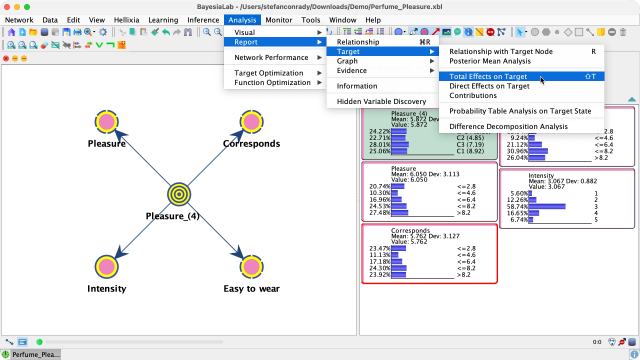
This analysis creates a report, which is displayed in a new window.
Report
Interpretation
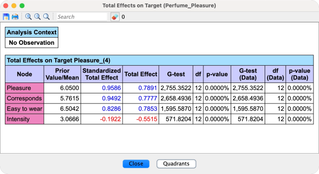
The report lists two effect measures for each Driver Node. Both are defined and explained on the Total Effect concept page; in short:
- The Total Effect is the change in the mean of the Target Node that accompanies a small change in the mean of the Driver Node, with all other nodes free to respond. BayesiaLab computes it as the derivative of the Driver Node’s Total Effect Curve at its a priori mean, i.e., at Delta Mean=0.
- The Standardized Total Effect is the Total Effect multiplied by the ratio of the standard deviation of the Driver Node to the standard deviation of the Target Node, which makes drivers measured in different units comparable.
For both measures, positive values are displayed in blue and negative values in red. The results are sorted by the Standardized Total Effect in descending order.
Limitations
A Total Effect is a single number, so it can only represent a Driver Node well where its Total Effect Curve is close to linear around the mean. The curves come from Target Mean Analysis:
The Driver Node highlights the limitation. Its Total Effect is the slope of the cyan dashed tangent at Delta Mean=0, and the curve shows that this value is not at all a fair representation of the entire dynamic between and the Target Node. The other Driver Nodes have fairly linear relationships with the Target Node; the slopes of their curves remain unchanged across their x-ranges, and for them the Total Effect characterizes the dynamics very well.
Independence Tests
In addition to the effects, the report includes independence test metrics:
- or G-test.
- You can select which test to use, i.e., or G-test, under
Menus > Window > Preferences > Tools > Statistical Tools.
- You can select which test to use, i.e., or G-test, under
- Degree of Freedom: Indicates the degree of freedom between each Driver Node and the Target Node.
- p-value: Reports the p-value calculated with selected independence test.
- If a dataset is associated with the network, the independence tests are also performed on the basis of the dataset.
Quadrant Chart
Clicking the button Quadrants at the bottom of the report window produces a so-called Quadrant chart.
The Driver Nodes’ marginal mean values are shown on the x-axis. The y-axis shows the Total Effects or Standardized Total Effects, which were shown in the report. You have a choice of displaying either metric in the pop-up window.
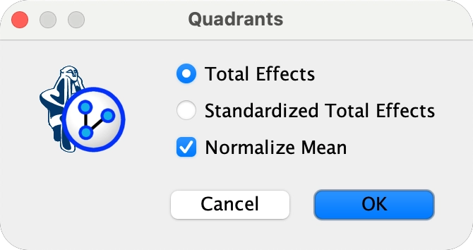
Upon confirming your selection, a new window presents the Quadrant Chart.
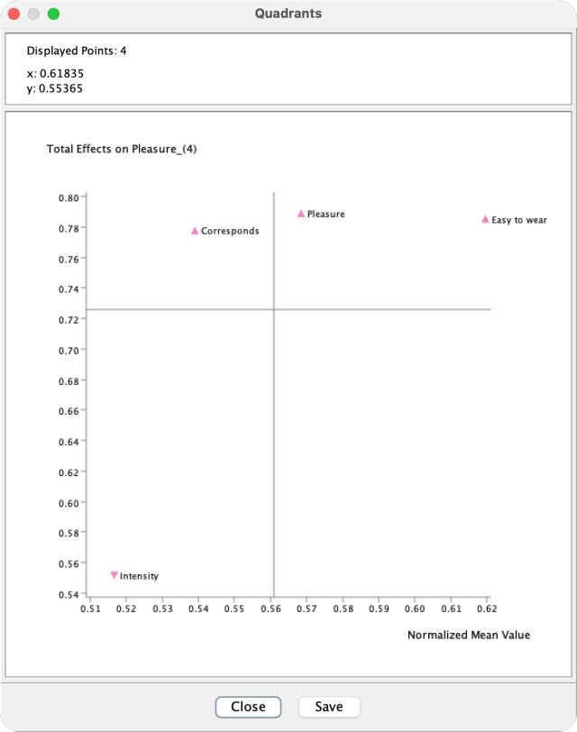
Each point in the Quadrant Chart represents a Driver Node. If a color is assigned to the nodes, the point will be shown in that color. The name of each Driver Node is displayed to the right of each point. When hovering over any of the displayed points with your cursor, the point’s coordinates are shown in the top panel. The top panel also shows the number of points displayed as well as any evidence context.
Quadrant Chart Axes
The chart is divided into four quadrants. The divider line on the x-axis is positioned at the mean value of all of the mean values, i.e., the mean of the mean. The divider line on the y-axis is positioned at the mean value of all the nodes’ calculated y metric, e.g., the mean of all Standardized Total Effects of the nodes on the Target Node, which is shown in this example.
Quadrant Interpretation
Depending on the domain, there are various ways to interpret the quadrants. For instance, in the context of key driver analysis of overall customer satisfaction, the x-values of the Driver Nodes could represent the current satisfaction level of individual product attributes. The y-values show the importance of each Driver Node with the Target Node, such as overall satisfaction with a product.
In this context, one can read the quadrants as follows:
- Quadrant 1 (top right): points in this quadrant represent drivers that have above average satisfaction and above average importance. Casually speaking, one could say, keep up the good work on these drivers.
- Quadrant 2 (bottom right): the points in this quadrant have above-average satisfaction but are below average in terms of importance. One could say that this is the “overkill” zone.
- Quadrant 3 (bottom left) features below-average drivers with below-average importance.
- Quadrant 4 (top left) delineates the “area of opportunity.” Drivers are below average in performance, have room to improve, and are important.
Quadrant Chart Options
The Quadrant Chart offers you several options via its Contextual Menu:
- Display the Driver Nodes’ Long Names instead of their standard names.
Copythe chart content in multiple formats:- Bitmap, e.g., png or jpg.
- Vector graphic, e.g., SVG or PDF.
- Table of x-y coordinates of points on chart:
- Formatted table in HTML format, which is practical for presentation purposes.
- Plain table in text format for further editing.
Printthe chart.
The chart is automatically resized with the size of the window.