Time Series
Context
The Time Series chart enables you to plot one or more numerical variables in the dataset’s sequential order.
Usage
You can access the Time Series function in multiple ways:
Menus > Data > Charts > Time Series.Node Contextual Menu > Charts > Time Series.
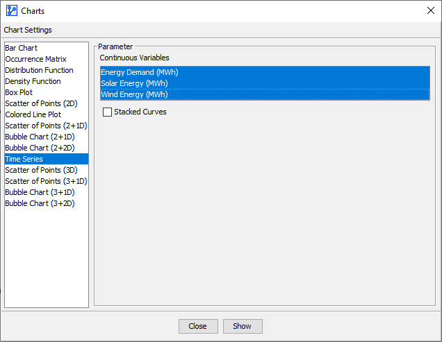
In the Parameter panel, select one or more Continuous variables from the dropdown lists. If you had nodes selected when you opened the Charts window, the variables in the dropdown menus are restricted to that selection. Select Stacked Curves if applicable, then click Show.
At the top of the chart window, the Information Panel reports the total number of plotted points plus the x and y coordinates of the cursor position.
To zoom in to the chart, click and hold the left mouse button. Drag the cursor to designate the area to focus on. Then, release the mouse button. Note that the size of the points remains unchanged regardless of the zoom level. To revert to the default zoom level, double-click anywhere on the chart. Note that you can change the line colors by clicking on the color fields in the Legend Panel.
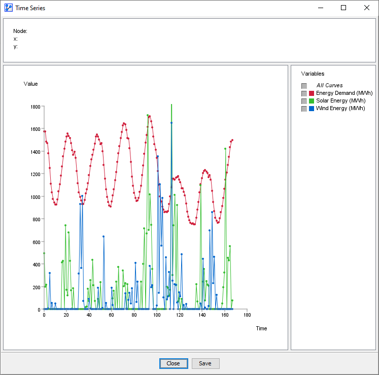
The following screenshot shows (red) and the available (green) and (blue) for an American city on an hourly basis over one week.
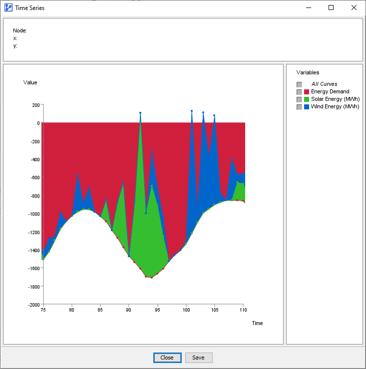
The Stacked Curves option can help visualize how values add up (or “stack up”) at each point in time. The following screenshot illustrates this concept. Here, is now shown with negative values to represent the load or the draw of the energy users. The energy sources, solar and wind, on the other hand, are shown with positive values, i.e., the variables and represent a contribution of energy.
The interpretation is straightforward. If the red, green, and blue areas add up to reach zero or go beyond zero at any point in time, the energy demand can be met.