
Cluster Interpretation: Histograms
Background & Context
On this page, we present the Histograms for cluster interpretation as an alternative to Most Relevant Explanations for Cluster Interpretation.
To provide further context for Most Relevant Explanations for Cluster Interpretation, we compare several other approaches that can help interpret individual Clusters:
- Setting Evidence for Cluster Interpretation: Posterior Distributions, Relationship with Target Node, Mosaic Analysis, Posterior Mean Analysis, Segment Profile Analysis, Histograms, Tornado Diagrams
- Optimization for Cluster Interpretation: Dynamic Profile, Target Optimization Tree
More specifically, we compare all these approaches with regard to characterizing the state of the Cluster Node in the reference network.
All analyses and instructions on this page refer to this reference network, which you can download here:

Histograms
To launch Histograms, select Menus > Analysis > Visual > Target > Target's Posterior > Histograms. A new window opens with one panel for each manifest node. At the top of the window, we can select the Cluster of interest, which is in our case.
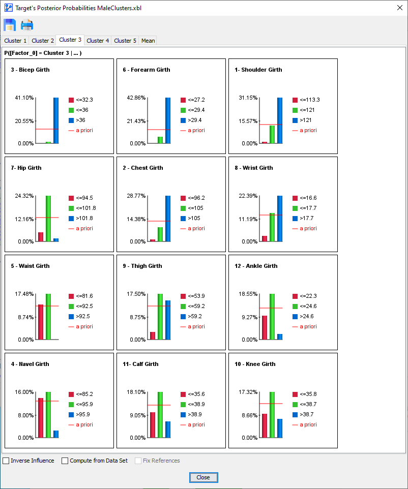
To explain the precise meaning of the panel content, we focus on the panel for the node .
The probability that an observation, i.e., an individual from the population, belongs to is:
- 9.23%, if
- 17.32%, if
- 7.27%, if
The a priori probability of belonging to is 12.96%, as indicated by the red line.