
Cluster Interpretation: Tornado Diagram
Background & Context
On this page, we present the Tornado Diagram for cluster interpretation as an alternative to Most Relevant Explanations for Cluster Interpretation.
To provide further context for Most Relevant Explanations for Cluster Interpretation, we compare several other approaches that can help interpret individual Clusters:
- Setting Evidence for Cluster Interpretation: Posterior Distributions, Relationship with Target Node, Mosaic Analysis, Posterior Mean Analysis, Segment Profile Analysis, Histograms, Tornado Diagrams,
- Optimization for Cluster Interpretation: Dynamic Profile, Target Optimization Tree
More specifically, we compare all these approaches with regard to characterizing the state of the Cluster Node in the reference network.
All analyses and instructions on this page refer to this reference network, which you can download here:

Tornado Diagrams
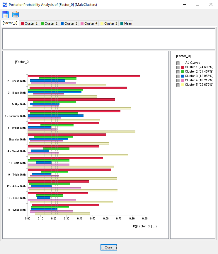
To start Tornado Diagrams, select Menus > Analysis > Visual > Target > Target's Posterior > Total Effects. The Tornado Diagram window opens up and presents an overview of all Clusters:
Given our interest in , we select the corresponding tab in the window.
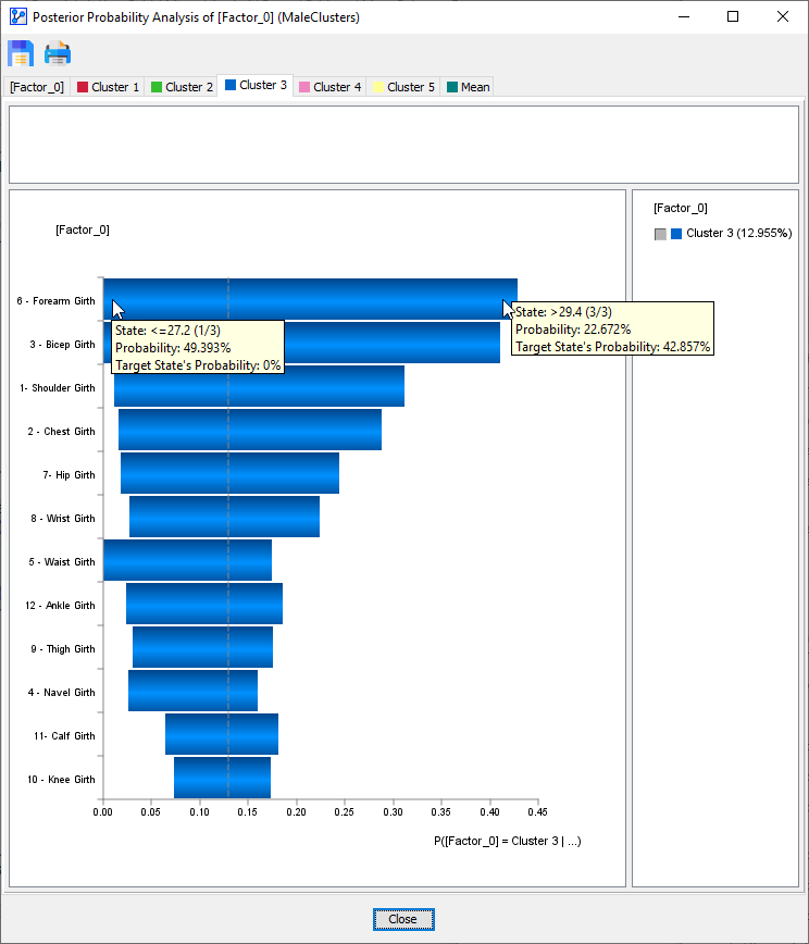
Each manifest node is associated with a blue horizontal bar that visualizes the impact that node can have with regard to membership in . Starting with the top node, , we see that its value range can reduce the probability of membership in to 0% and increase the probability of membership in to 42.857%. Among all nodes, it has the biggest sway over membership in . At the bottom end, , appears to have the least impact on membership in . It can only change the membership probability by 10 percentage points.
For reference, the gray dashed vertical line indicates the a priori probability of membership in , i.e., 12.96%. With this reference point, we can see the upside and downside potential of a node. For instance, can bring the membership probability down to 0%, but only lift it 5 percentage points beyond the a priori probability of 12.96%.