
Data Preparation
Source Data
Our case study uses real-world data from the auto industry, which has conducted customer satisfaction research for decades. More specifically, we utilize the 2009 New Vehicle Experience Survey (NVES), a syndicated study conducted by Strategic Vision, Inc., which surveys new vehicle buyers in the U.S. This study is widely used in the auto industry, and it is one of the principal resources for market researchers and product planners. NVES contains over 1,000 variables and close to 200,000 respondent records. Among many demographic and psychographic variables, NVES contains 98 individual satisfaction measures, ranging from Acceleration to Wiper System Controls.
Data Selection
From the original NVES dataset consisting of 1,089 columns and 71,200 rows, we select 103 columns that are relevant for the purposes of this tutorial [4].
The first group of columns refers to the vehicle type, e.g., make, model, and vehicle segment. The second group includes 98 columns that all concern the vehicle buyer’s satisfaction with specific aspects of the purchased vehicle, ranging from Ability to Control Sound to Wiper System Controls.
For notational convenience, we rename a number of frequently used variables as follows:
- New Model Segment ➔ Segment
- New Model Purchased - Brand ➔ Make
- New Model Purchased (Alpha Order) ➔ Make/Model
- Rate Buy Another From Same Manufac. ➔ Loyalty
Coding
NVES measures all satisfaction-related variables on an ordinal scale, from 1 (A failure) to 5 (Delightful), as shown in the excerpt from the printed questionnaire.
[4] See the appendix for a complete list of the selected variables.
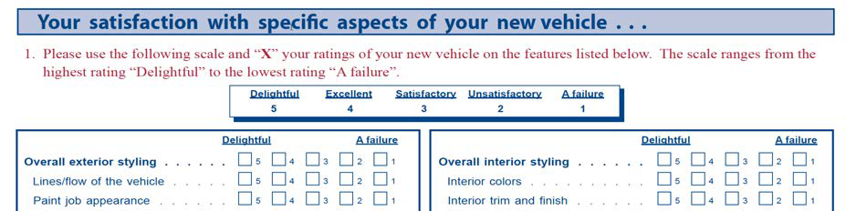
For analysis purposes, most market researchers have typically been using the NVES satisfaction ratings linearly transformed into a 1.5-9.5 scale. We will follow this convention in our tutorial.
Loyalty is asked in the NVES with the following question, which also features an ordinal scale for the response, ranging from Definitely will not to Definitely will.

Given that our objective is loyalty optimization, we need to associate a numerical value with each of the ordinal states of this response variable. The following linear assignment of probabilities is somewhat arbitrary, but for the purpose of this study we will accept it as a reasonable approximation.
| Response | Probability |
|---|---|
| Definitely Will Not | 0.00 |
| Probably Will Not | 0.25 |
| Do Not Know | 0.50 |
| Probably Will | 0.75 |
| Definitely Will | 1.00 |
Data Import
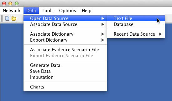
To start the analysis with BayesiaLab, we first import the survey dataset, which was provided as a CSV file [5]. With Data > Open Data Source > Text File, we start the Data Import Wizard, which immediately provides a preview of the data file.
[5] CSV stands for “comma-separated values,” a common format for text-based data files.
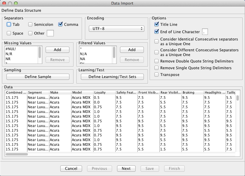
The table displayed in the Data Import wizard shows the individual variables as columns and the responses as rows. There are a number of options available, e.g., for sampling. However, this is not necessary in our example given the relatively small size of the database.
Clicking the Next button prompts a data type analysis, which provides BayesiaLab’s best guess regarding the data type of each variable.
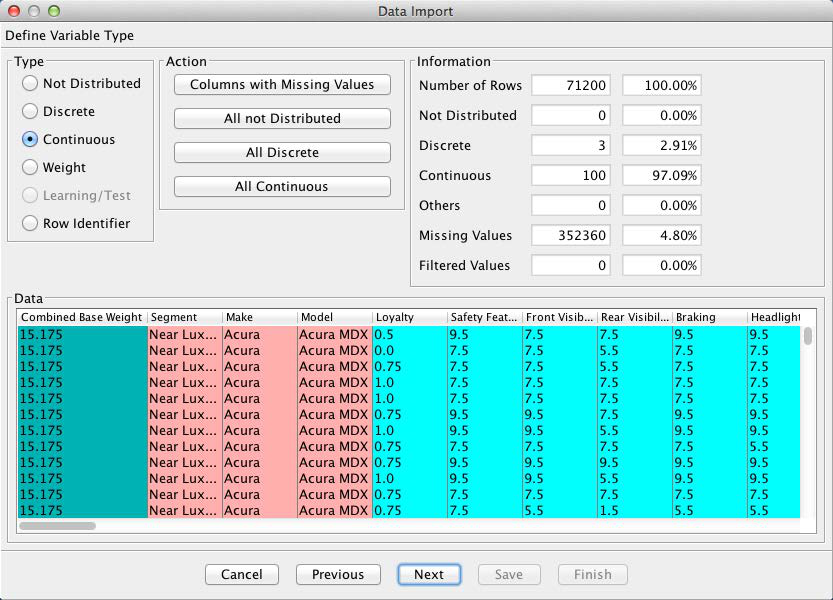
Furthermore, the Information box provides a brief summary regarding the number of records, the number of missing values [6], filtered states, etc.
In this example, we will need to override the default data type for the Combined Base Rate variable. This variable serves as the survey weight of each observation. We change the data type by highlighting the column and clicking the Weight check box, which changes the color of the Combined Base Rate column to green.
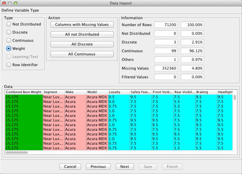
[6] There are no missing values in our database and filtered states are not applicable in this survey.
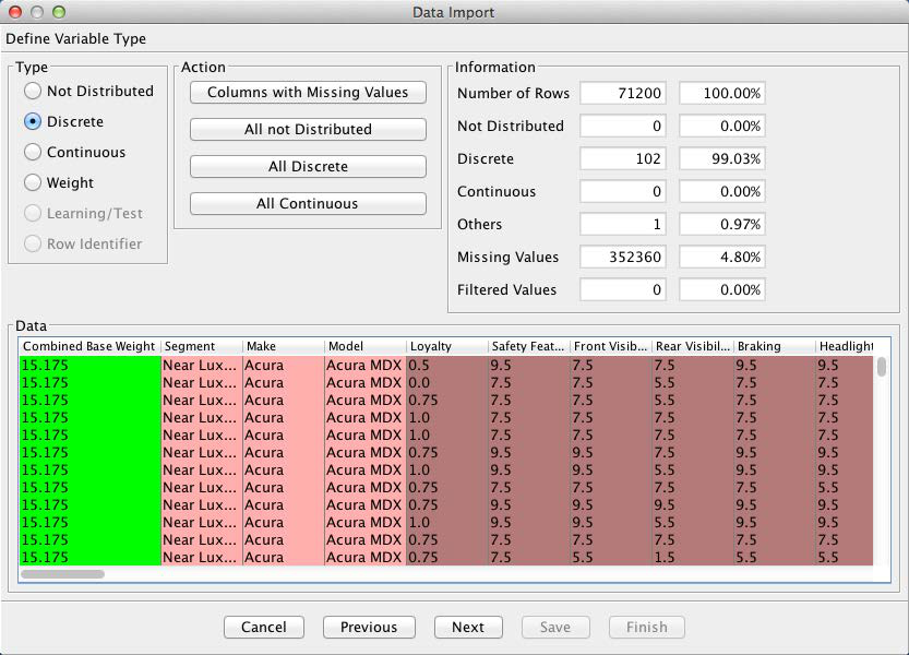
BayesiaLab interprets all the numerical columns as Continuous, which is technically correct. Consequently, BayesiaLab would attempt to discretize these variables. However, in our case, these variables were already discretized by the response levels given in the questionnaire. Thus, we will use this discretization as is. We do so by highlighting all continuous variables and then ticking the Discrete checkbox.
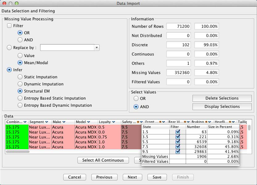
The next screen provides options as to how to treat any missing values. As shown by the Information panel, 4.8% of all values are missing in this dataset. Clicking the small upside-down triangle next to the variable names brings up a window with key statistics of the selected variable, in this case Loyalty.
Furthermore, columns with missing values are highlighted with a small question mark symbol. By highlighting any such variable, we are given the option of selecting the missing values imputation algorithm under the Infer section of the window.
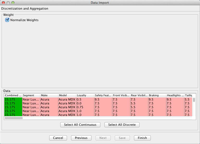
Given that we are using weights in this dataset, we now have an option to Normalize Weights. If we left this option unchecked, each record in the dataset would be counted as many times as the weight indicates. For instance, the first row would be counted 15.175 times. Applied to all rows, this would yield the correct proportion of observations relative to each other. However, BayesiaLab would subsequently end up “overlearning” from 3,233,840.85 weighted observations [7]. To avoid generating a false sense of precision, we select Normalize Weights, so each response, on average, represents one transaction.
[7] Each response in this survey, on average, represents roughly 45 vehicle purchases.
Upon completion of the import process, we obtain an initially unconnected network, which is shown below in the screenshot. All variables are now represented as nodes, one of the core building blocks in a Bayesian network. A node can stand for any variable of interest. Once the variables appear in this form in a graph, we will exclusively refer to them as nodes.
The wide spectrum of nodes can now be seen at a glance. For clarity, this network is shown without its graph panel window. Whenever the context is clear, we will present the network by itself in this tutorial.