
Supervised Learning and Key Driver Analysis
Supervised Learning
We can now use Supervised Learning to discover the relationships between the Target Node and the factors. We use the Augmented Markov Blanket, which is one of BayesiaLab’s Supervised Learning algorithms.
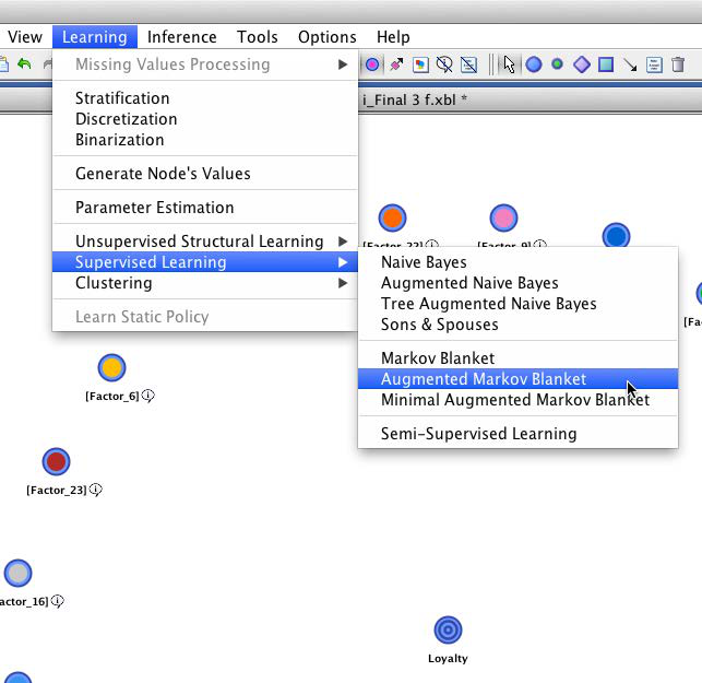
Using the default setting for the Structural Coefficient (SC=1), this learning algorithm yields the following network:
Structural Coefficient Analysis
In the newly-learned network, we see a total of 88 arcs connecting the 24 factor nodes and the target. Some nodes have up to five parent nodes, which implies a six-dimensional conditional probability table for those nodes. Given this relatively high level of network complexity, it is prudent to perform a Structural Coefficient Analysis: Tools > Cross Validation > Structural Coefficient Analysis.
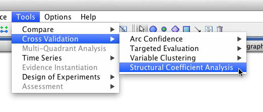
This way we can examine, among other metrics, the data-to-structure ratio as a function of the structural network complexity.
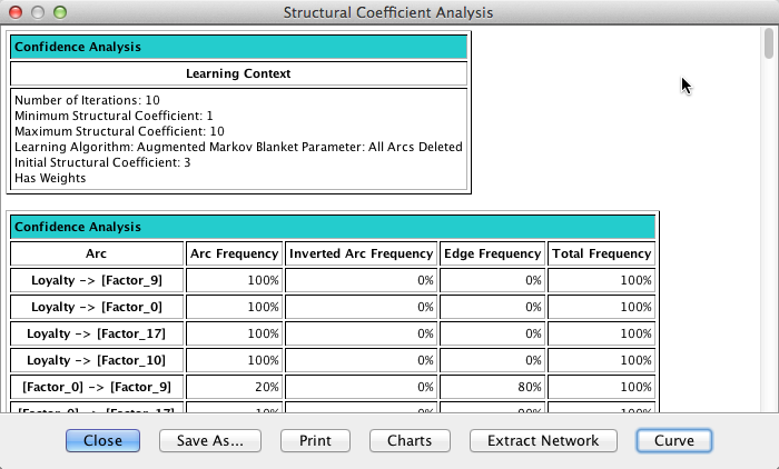
Once the report is presented, clicking Curve produces a kind of “scree plot”, which helps us identify a reasonable value of the Structural Coefficient. Unlike the scree plot we know from Factor Analysis, we read this plot from right to left.
By visual inspection of this graph, moving from right to left along the x-axis, we see an inflection point of the curve around SC=3. Below that value, the structural complexity is increasing faster than the data likelihood. Thus, we choose SC=3 and relearn the network on that basis with the Augmented Markov Blanket algorithm.
The resulting network is considerably simpler than before, now featuring only 65 arcs. Also, the Turning Radius and Taillights Function factors are no longer part of the network, which suggests that these two factors are least relevant with regard to loyalty.
Target Mean Analysis
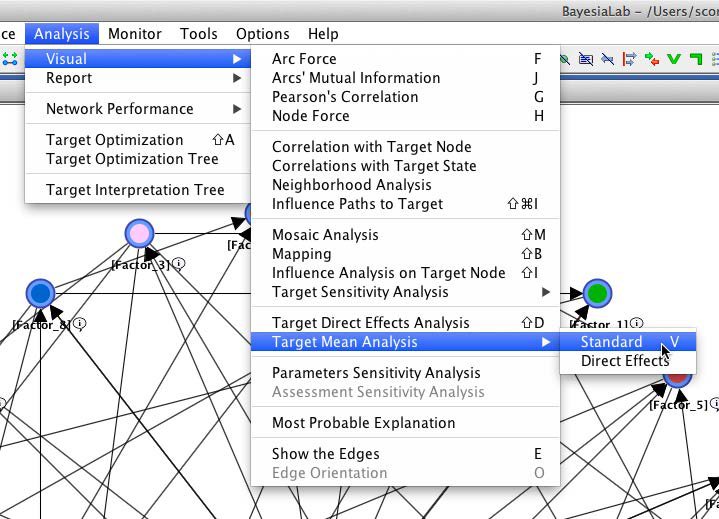
On the basis of this network structure, we can now examine the relationships between the factors and the target node. For this step, we select Analysis > Visual > Target Mean Analysis > Standard. This function computes the mean value of the Target Node by varying each factor, one at a time, across its entire range of values.
The Target Mean Analysis provides a quick overview of how our factor values are associated with the Target Node. The y-axis shows the mean values of the Target Node as a function of the factor values on the x-axis.
This plot suggests that all the factors are approximately linearly associated with the Target Node. Furthermore, the curves appear to run almost parallel between the x-values of 7.5 and 9. As a result, it is reasonable to formally compute “parameter estimates” for the slopes of these curves.
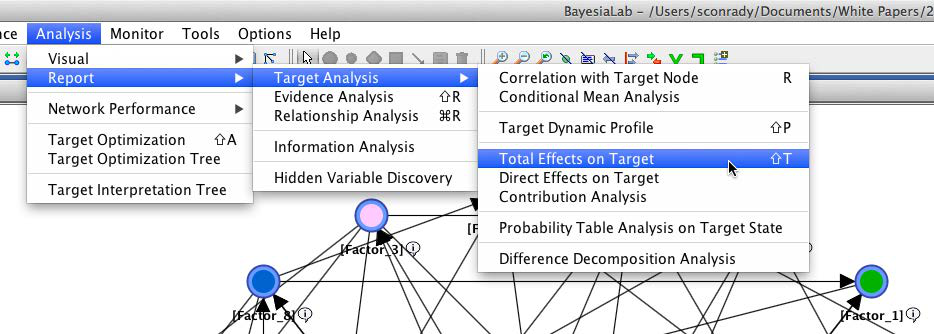
In BayesiaLab, this can be done by means of simulation via Analysis > Report > Target Analysis > Total Effects on Target. More specifically, BayesiaLab computes the derivative around the mean value of the x-range of each factor.
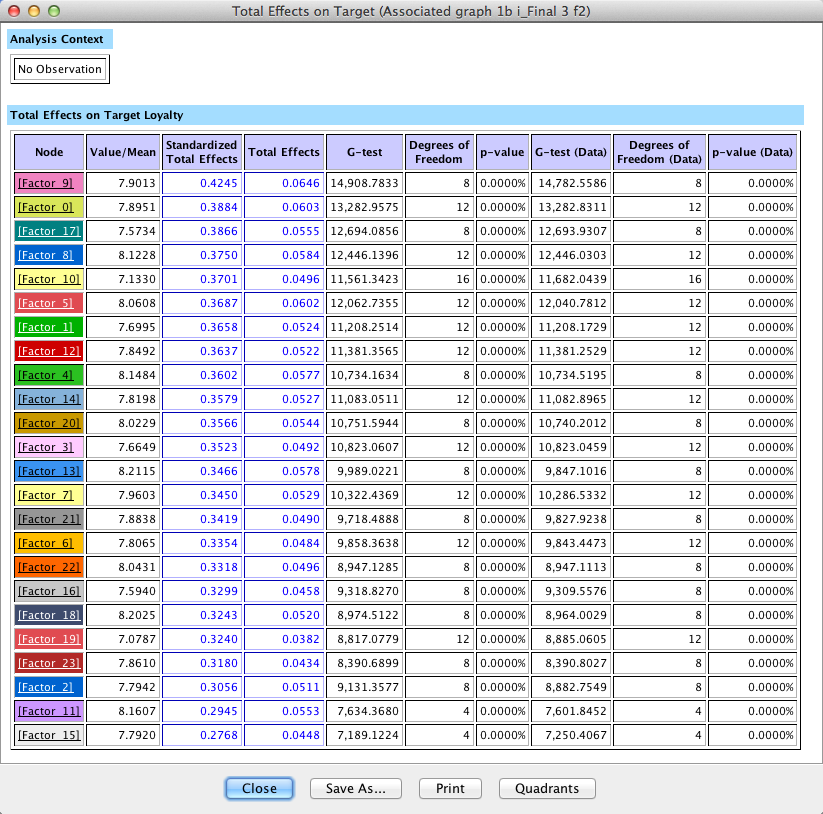
The results are presented in a table. The Total Effects column shows the change of the mean value of the Target Node, given the observation of a one-unit change in each of the factors. This value is what we commonly interpret as slope.
Clicking Quadrants on the report window shows a scatterplot with factor values on the x-axis and Total Effects on the y-axis. This allows us to better distinguish the factors, even though they have Total Effects in a fairly narrow range around 0.4 to 0.6.
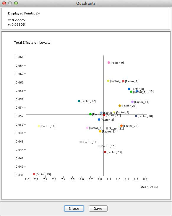
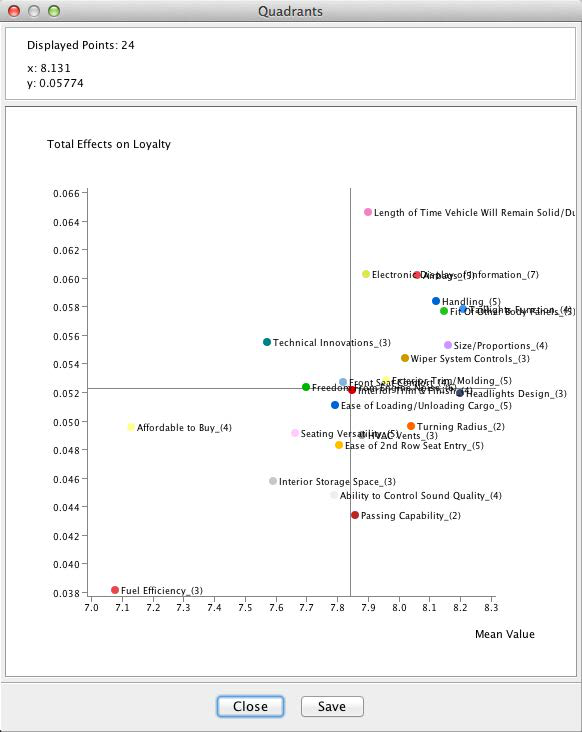
With the highest Total Effect, Length of Time Vehicle Will Remain Solid/Durable marks the top value on the y-axis of the plot. The factor Fuel Efficiency marks the bottom end on both axes. The position of the Fuel Efficiency factor is perhaps curious as our survey data covers 2009, when the auto industry was most severely affected by the recession.
However, as interesting as this may seem, it is probably of little practical use for planning purposes as this plot represents a view of the entire market, across all makes and all segments. It is reasonable to assume that effect heterogeneity exists between vehicle segments as different as Full-Size Pickups and Luxury Sedans.