
Initial Review, Unsupervised Learning, and Mapping
Initial Review
Upon data import, it is good practice to review the probability distributions of all nodes. The best way to get a complete overview is to switch to Validation Mode (F5), select all nodes (Ctrl+A), and then double-click on any one of them. This brings up the Monitors for each node within the Monitor Panel.
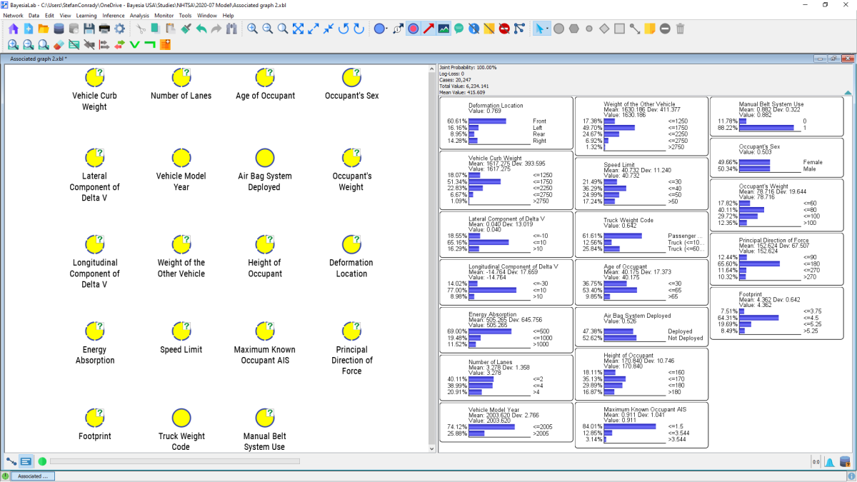
Each Monitor contains a histogram representing the marginal probability distributions of the states of its associated node. This allows us to review the distributions and compare them with our own domain understanding. For instance, the gender mix, OA_SEX, is approximately at the expected uniform level, and other nodes appear to have reasonable distributions, too.
Distance Mapping
Going beyond these basic statistics of individual nodes, we can employ a number of visualization techniques offered by BayesiaLab. Our starting point is Distance Mapping based on Mutual Information: Menus > View > Graph Layout > Distance Mapping > Mutual Information. As the name of this layout algorithm implies, the generated layout is determined by the Mutual Information between each pair of nodes.
By invoking the Distance Mapping function, Menus > View > Graph Layout > Distance Mapping > Mutual Information, BayesiaLab presents the distance between any pair of nodes inversely proportional to their Mutual Information.
Among all nodes in our example, there appear to be several clusters that can be intuitively interpreted. Principal Direction of Force and , in the above graph, reflect impact angle and deformation location, two geometrically connected metrics. , , and are closely related to each other and to the overarching concept of vehicle size. Quite literally, knowing the state of a given node reduces our uncertainty regarding the states of the nearby nodes.
Unsupervised Learning
When exploring a new domain, we usually recommend performing Unsupervised Learning on the newly imported database. This is also the case here, even though our principal objective is targeted learning, for which Supervised Learning will later be the main tool. Menus > Learning > Unsupervised Structural Learning > EQ initiates the EQ algorithm, which is suitable for the initial review of the database.
In its raw form, the crossing arcs make this network somewhat tricky to read. BayesiaLab has a number of layout algorithms that can quickly disentangle such a network and produce a much more user-friendly format. We select Menus > View > Automatic Graph Layout or alternatively use the shortcut P.
Now we can visually review the learned network structure and compare it to our own domain knowledge. This allows us to do a “sanity check” of the database and the variables, and it may highlight any inconsistencies.
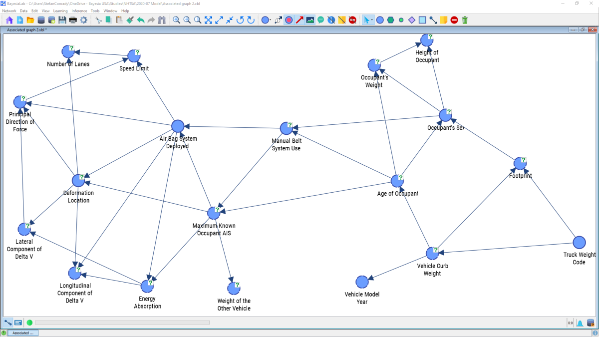
Indeed, in our first learning attempt, we immediately find 34 arcs between the 19 variables included in the model, so interactions appear to be manifold.
Although it is tempting, we must not interpret the arc directions as causal directions. What we see here, by default, are merely statistical associations, not causal relations. We would have to present a significant amount of theory to explain why Bayesian networks always must have directed arcs. However, this goes beyond the scope of this presentation. Rather, we refer to the literature listed in the references and our other white papers.
Mapping
Beyond qualitatively inspecting the network structure, BayesiaLab allows us to visualize the quantitative part of this network. To do this, we first need to switch to the Validation Mode F5. In Validation Mode, we start the Mapping function: Menus > Analysis > Visual > Overall > Mapping
The Mapping window opens up and presents a new view of the graph.
The Mapping window features drop-down menus for Node Analysis and Arc Analysis. However, we are only interested in Arc Analysis at this time and select Pearson Correlation as the metric to be displayed.
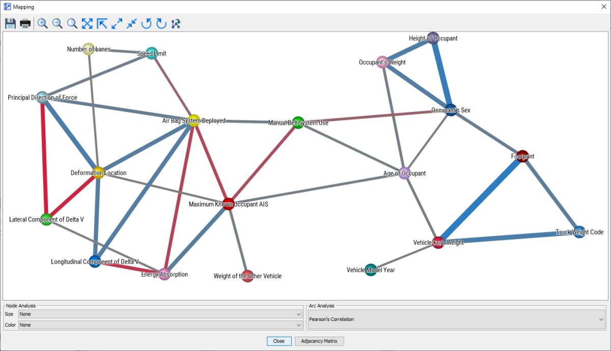
The thickness of the arcs, beyond a fixed minimum size, is now proportional to the Pearson Correlation between the nodes. Also, the blue and red colors indicate positive and negative correlations respectively.
BayesiaLab can also visualize the same properties in a slightly different format. This is available via Menus > Analysis > Visual > Overall > Arc > Pearson Correlation.
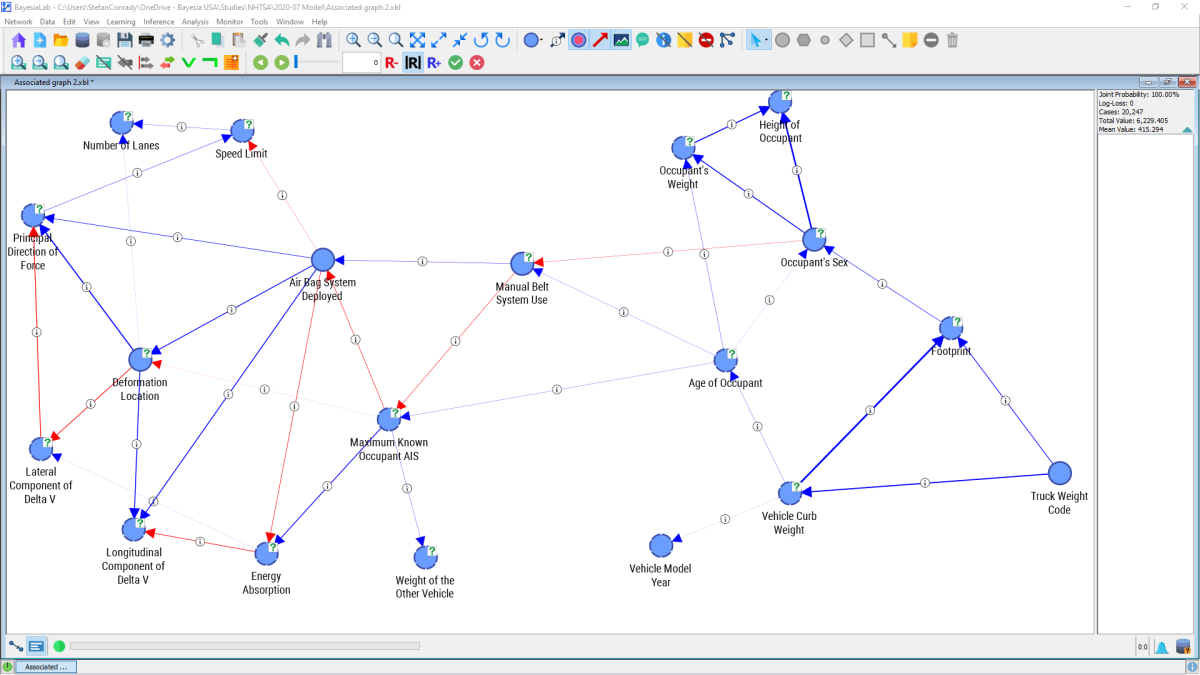
Here, too, the arc thickness is proportional to Pearson Correlation. Additionally, callouts indicate that further information can be displayed. We opt to display this numerical information via Menus > View > Show Arc Comments.
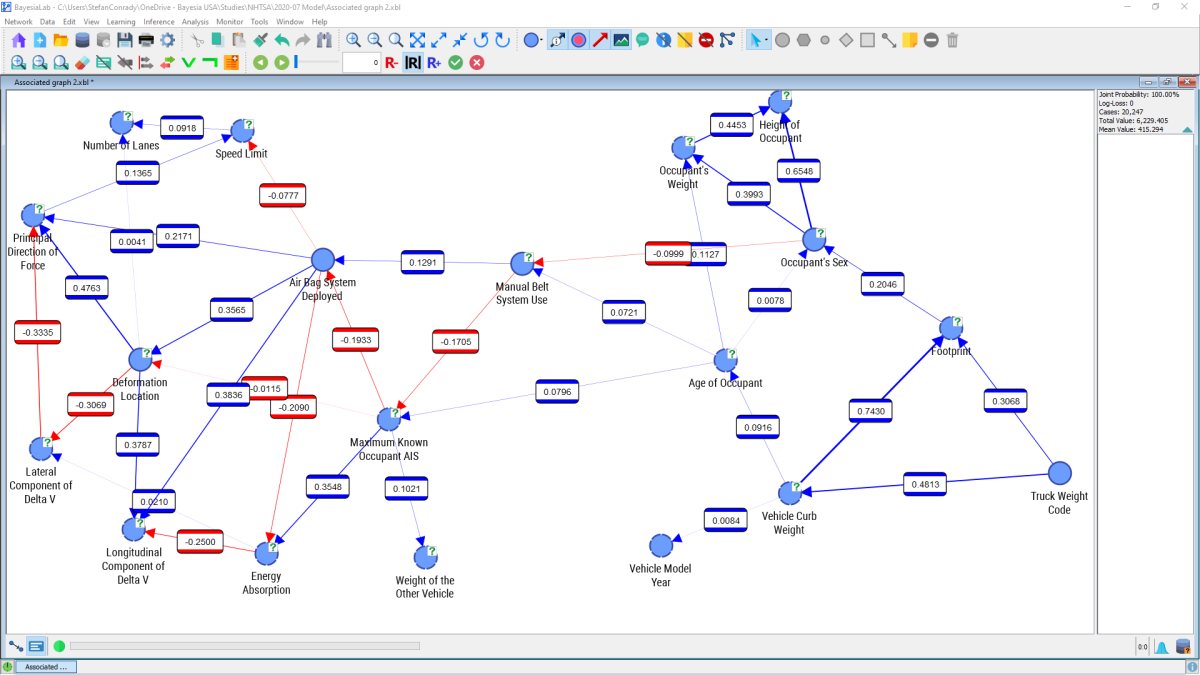
The multitude of numbers presented in this graph can still be overwhelming. We may wish to “tune out” weaker connections to focus on the more important ones. The slider control within the menu bar allows us to interactively change the threshold below which connections should be excluded from display.

In this setting, only nodes are shown that are connected with an absolute correlation coefficient of 0.34 or higher. The remaining nodes and arcs, below that threshold, are grayed out.
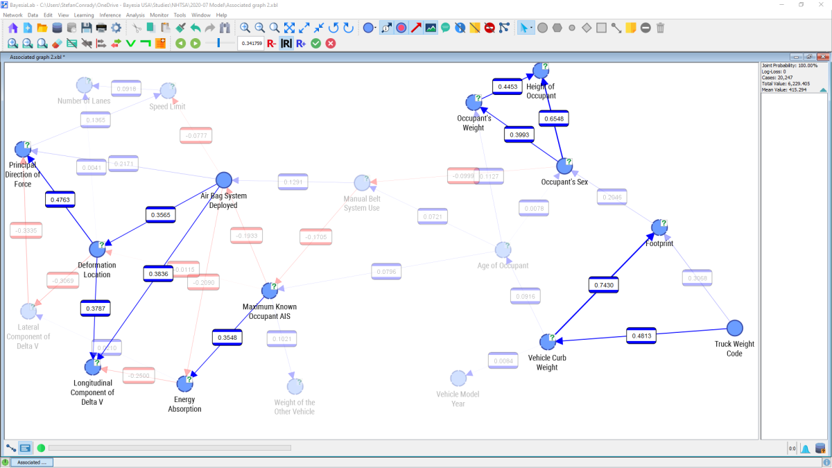
There are a number of nodes that stand out as highly correlated, in particular , , and . This is plausible as these nodes can be understood as proxies for overall vehicle size. Strong relationships also exist between , Occupant’s Weight, and Occupant’s Sex, which is consistent with our general knowledge that men, on average, are taller and heavier than women.
Note that BayesiaLab can compute Pearson Correlation for any pair of nodes with ordered states, regardless of whether they are numerical or categorical (e.g. Monday, Tuesday, etc.). However, the computed values are only meaningful if a linear relationship can be assumed. For some of the node pairs shown above, this may not be an unreasonable hypothesis. In the case of and Principal Direction of Force it would not be sensible to interpret the relationship as linear. Rather, the computed correlation is purely an artifact of the random ordering of states of . However, we will see in the next section that strong (albeit nonlinear) links do exist between these variables.
Mutual Information
An alternative perspective on the relationships can be provided by displaying Arc’s Mutual Information, which is a valid measure regardless of variable type, i.e. including the relationships between (not-ordered) categorical and numerical variables: Menus > Analysis > Visual > Overall > Arc > Mutual Information.
As before, we can bring up the numerical information by selecting Menus > View > Show Arc Comments.
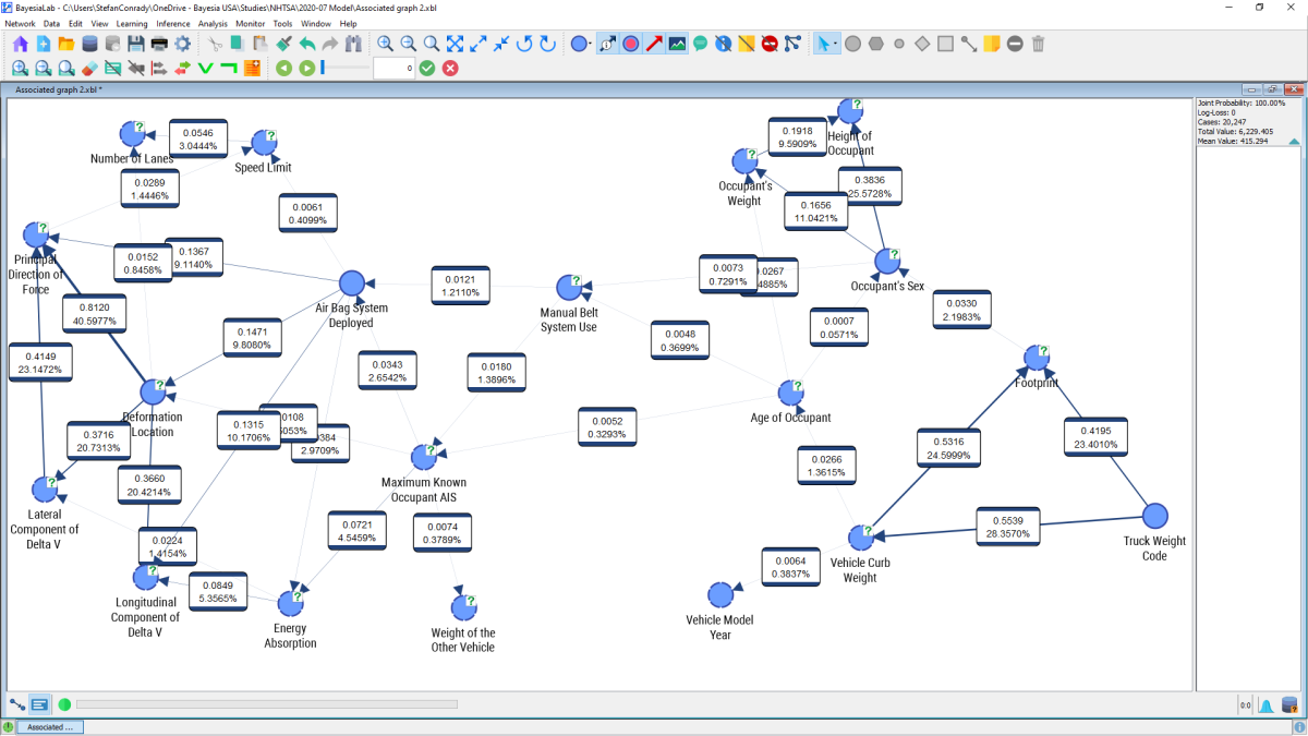
Mutual Information I(X,Y) measures how much (on average) the observation of a random variable tells us about the uncertainty of X, i.e. by how much the entropy of X is reduced if we have information on Y. Mutual Information is a symmetric metric, which reflects the uncertainty reduction of X by knowing Y as well as of Y by knowing X.
We can once again use the slider in the menu bar to adjust the threshold for the display of arcs. Moving the slider towards the right, we gradually filter out arcs that fall below the selected threshold.

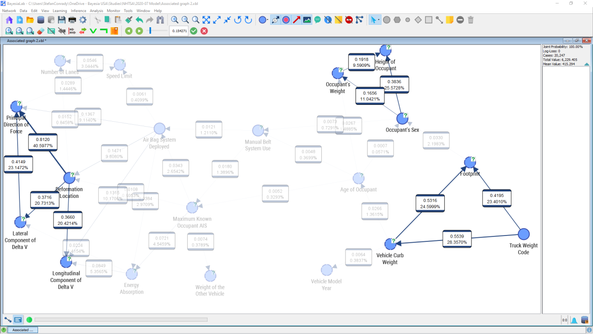
Focusing on one particular relationship, we can see that knowing the value of on average reduces the uncertainty of the value of Principal Direction of Force by 0.8120 bits.
Conversely, knowing Principal Direction of Force reduces the uncertainty of by 0.8120 because Mutual Information is a symmetric metric.