Direct Effects Analysis
Direct Effects on Target Report
We now return to our marketing example for good and utilize Likelihood Matching to estimate the Direct Effect of each driver variable on the Target Node Sales.
- From within the
F5](/bayesialab/user-guide/view/validation-mode), selectMenu > Analysis > Report > Target > Direct Effects on Target.
This prompts BayesiaLab to estimate the Direct Effects of each driver variable with regard to the Target Node while performing Likelihood Matching on all Confounders.
The resulting table resembles the typical output we would obtain from a linear regression analysis with parameter estimates for each covariate. As such, we may be tempted to interpret the Direct Effect as the slope of a response curve. Indeed, BayesiaLab computes the Direct Effect as the derivative of the response curve around the mean of the values of each driver. If each response curve were linear, the Direct Effect would indeed be a meaningful value for characterizing the entire curve. The question is, does this assumption of linearity hold? In Simpson’s Paradox, it certainly did. Due to the binary nature of all variables, the example was inherently linear. Hence, computing a single coefficient for the Direct Effect was adequate for describing the causal effect.
Target Mean Analysis
In this marketing mix example, however, we can make no such assumption. Rather than speculating about the nature of the relationships, we let BayesiaLab estimate the response curves, whatever their shapes might be:
- Select
Menu > Analysis > Visual > Target > Target's Posterior > Curves > Direct Effects. - Then, from the options, choose:
- Target: Mean
- Variables: Mean
- Use Hard Evidence
- Click Display Sensitivity Chart, which generates a plot of Sales as a function of each driver variable.
Note that the nodes in the Class Non_Confounder are not included here.
Also, all drivers are represented with their original scales, so Weekday (Weekday ∈ 1,...,7), Quarter (Quarter ∈ 1,...,4), and End-of-Month Indicator (End-of-Month Indicator ∈ 0,1) are all squeezed into the leftmost portion of the plot. Later, we will “decompress” the plot by normalizing the drivers’ value range so they all appear on a 1-100 scale.
For now, however, we want to focus on a single driver:
- Remove all curves by clicking the All Curves checkbox.
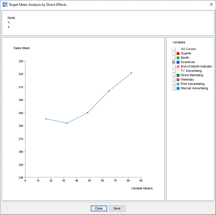
- Select only Incentives, which leaves one curve.

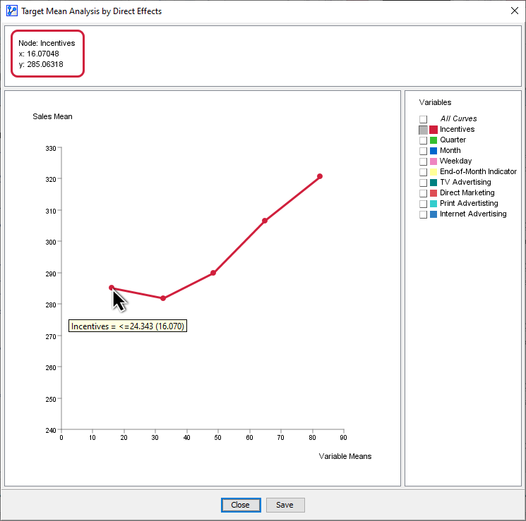
The x-values of the points on the curve correspond to the mean values of the discretized states of Incentives. Given that we discretized Incentives into 5 bins, we have 5 discrete x-values. The y-values are the expected values of the Target Node Sales at each corresponding x-value of Incentives.
It is important to understand that while the node Incentives varies in value, all Confounders are balanced through Likelihood Matching in such a way that Incentives is independent of all the Confounders. With that, we can consider setting each value of Incentives as a deliberate intervention, and the changes to outcome variable Sales are the causal effect of changing Incentives. Thus, the curve we see is a causal response curve.
Replicating Target Mean Analysis Step-by-Step
Given the importance of Target Mean Analysis, we now simulate the curve plotting process step by step. We show what is happening in BayesiaLab “behind the scenes” as the curve is plotted using Direct Effects.
- Select the Monitors of all Confounders.
- Apply Fix Probabilities to all Confounders.
This “fixed” status is indicated by purple bars in the Monitors of the Confounders.
Note that you must not fix the probabilities of the Non-Confounders. Their Monitor bars have to remain blue. Incentives and Sales, of course, must remain unfixed as well. The former you will manipulate, and the latter’s response you want to observe.
- Set Incentives to each possible state, from the lowest to the highest. Likelihood Matching maintains the distributions of all the Confounders while Sales and the Non-Confounders can respond to the intervention.
To further illustrate this important process, we have extracted the Monitors for Incentives and Sales from the Monitor Panel above and lined them up side-by-side:
For instance, given the state Incentives <=24.343, which has a mean value of 16.070, Sales has a mean value of 285.063 (see leftmost panel). So, the mean values of Incentives and Sales are the x and y coordinates of the first point on the response curve below. The remaining points on the curve are formed in the same way.

Note that this step-by-step approach was only meant to show what BayesiaLab is performing in the background whenever you invoke the Target Mean Analysis plot.
Target Mean Analysis (Direct Effects)
Now that we have explained how the Target Mean Analysis plot is generated, you can let BayesiaLab perform it again automatically for all drivers, similar to what we did in its first run:
- Select
Menu > Analysis > Visual > Target > Target's Posterior > Curves > Direct Effects.
At the time, however, it was difficult to interpret and compare the curves as the marketing variables were all recorded on different scales.
- In this run, select Normalize in the dialog box, which brings all x-values on a common 0-100 scale.
- Once the plot appears, deselect the calendar-related variables, i.e., Weekday, Quarter, Month, and End-of-Month Indicator.
We leave them out for now as they are of lesser interest to us—we cannot modify the calendar after all. Later in our analysis, we will assign a special status to them to formally exclude these variables from being optimized.
This provides an informative picture. We can now characterize the response of Sales to the drivers that ACME has under control. More specifically, we observe the exclusive Direct Effect of each driver on Sales without confounding effects through the other variables.
Response Curve Patterns
What is perhaps most striking in this plot is that many of the curves appear non-linear. Clearly, any assumption of linearity would not have held. Using the Direct Effects on Target Report, which we used earlier to estimate the slope of these curves, did entirely obscure the dynamics we can observe now.
Furthermore, we can derive several important insights from this plot. For instance, the response curve for TV Advertising rises quickly around its middle values, peaks, and then declines. Direct Marketing looks like an upside-down U, suggesting that there is a “sweet spot” in terms of marketing exposure. The curve for Print Advertising looks S-shaped, while the variable Incentives appears to be exponentially linked to Sales.
The “wild mix” of response curve patterns highlights the inherent difficulty of marketing mix optimization. While the curves themselves may be individually meaningful to a marketing expert, it is far from obvious how much should be allocated to each marketing channel within the constraints of an overall marketing budget.
