Step 3: Multiple Clustering
The Cluster Cross-Validation was merely a review, and it did not change the factors we confirmed when we clicked the Validate Clustering button. Although we have defined these Factors in terms of Classes of Manifest variables, we still need to create the corresponding latent variables via Multiple Clustering. This process creates one discrete Factor for each Cluster of variables by performing Data Clustering on each subset of clustered manifest variables.
In traditional statistics, deriving such latent variables or factors is typically performed by means of Factor Analysis, e.g., Principal Components Analysis (PCA).
Data Clustering
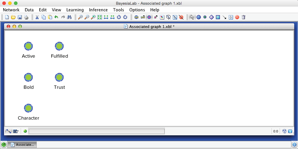
Before we run this automatically across all factors with the Multiple Clustering algorithm, we will demonstrate the process on a single cluster of nodes, namely the nodes associated with Factor_0: Active, Bold, Character, Fulfilled, and Trust. We simply delete all other nodes and arcs and save this subset of nodes as a new, separate XBL file.
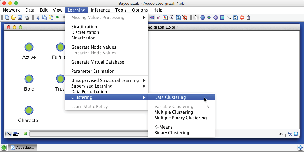
The objective of BayesiaLab’s Data Clustering algorithm is to create a node that compactly represents the joint probability distribution defined by the variables of interest. We start Data Clustering via Menu > Learning > Clustering > Data Clustering. Unless we select a subset, Data Clustering will be applied to all nodes.
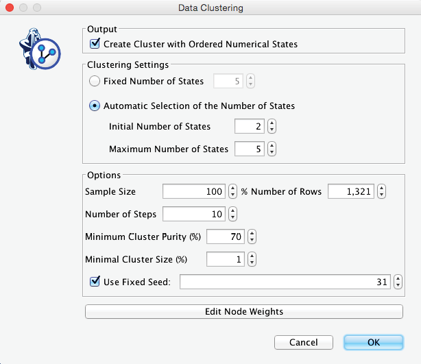
In the Data Clustering dialog box, we set the options as shown below. Among the settings, we need to point out that we leave the number of states of the to-be-induced factor open; we only set a range, e.g., 2-5. This means we let BayesiaLab determine the optimal number of states for representing the joint probability distribution.
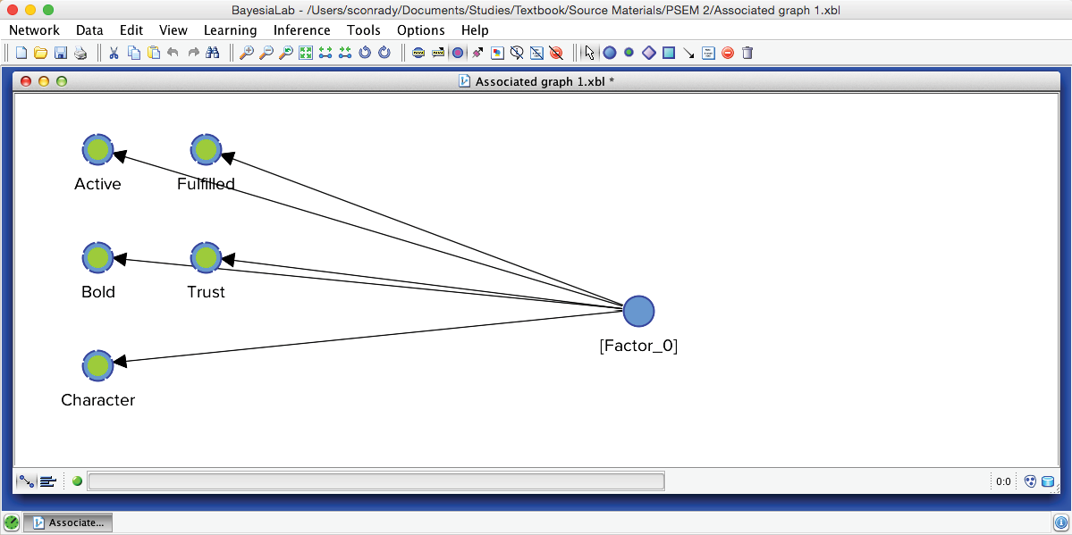
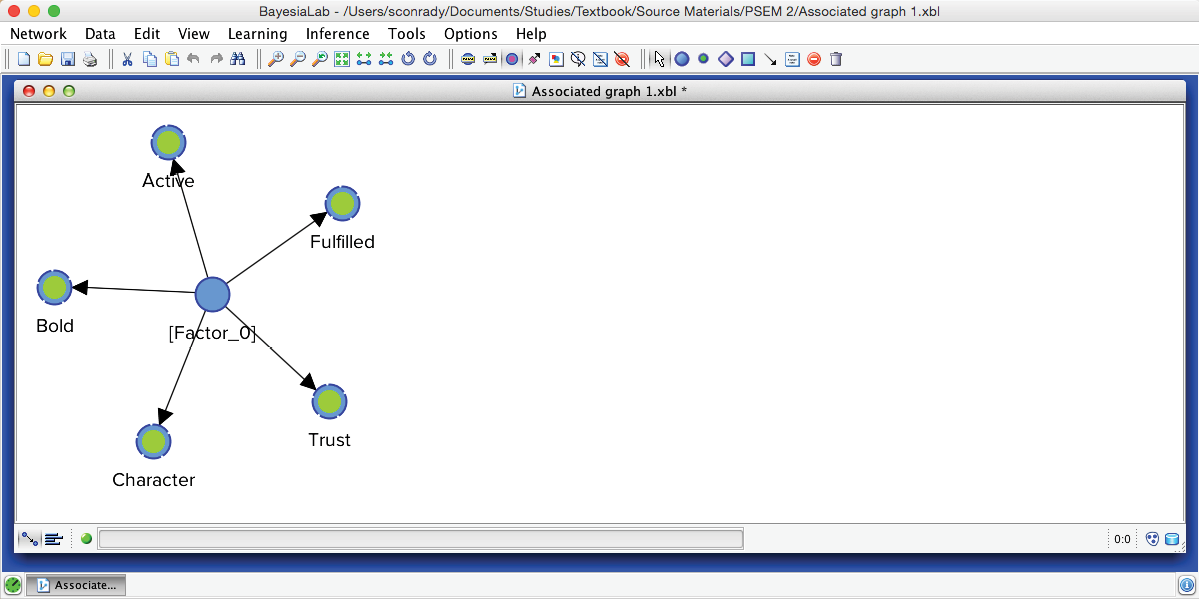
Upon completing the clustering process, we obtain a graph with newly induced [Factor_0] being connected to all its associated manifest variables.
Furthermore, BayesiaLab produces a window that contains a comprehensive Clustering Report.
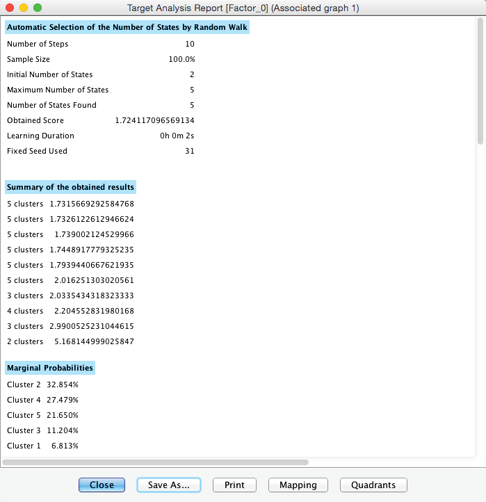
Given its size, we show it as two separate tables below.
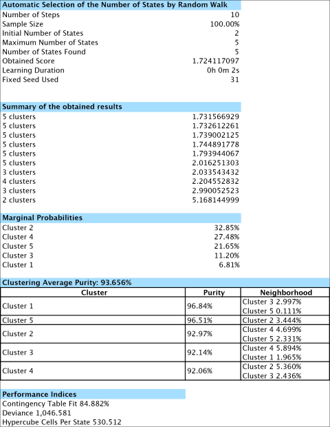
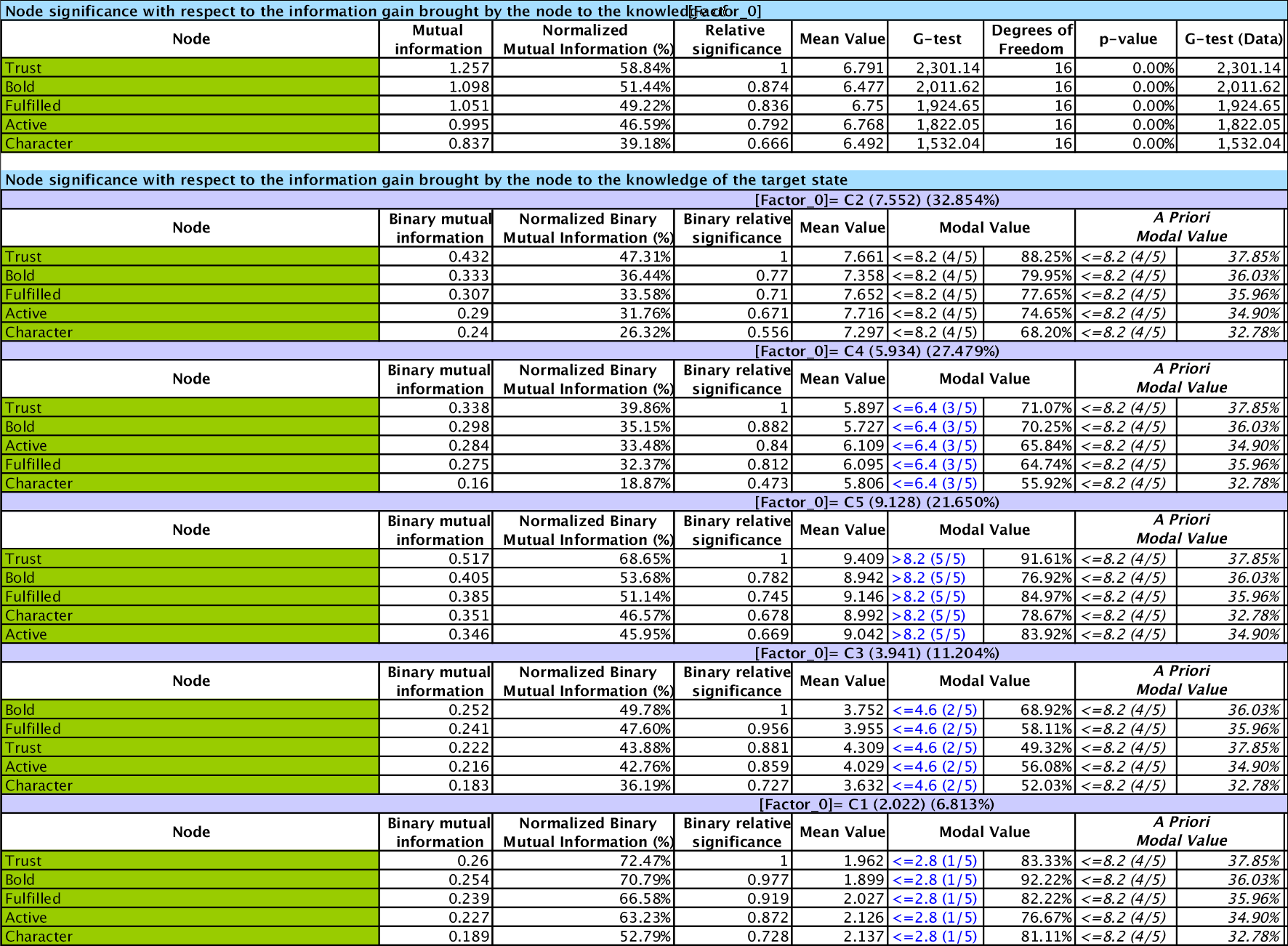
Relative Significance
In the second part of the report, the variables are sorted by Relative Significance with respect to the Target Node, which is [Factor_0].
where represents the manifest variable, and represents the factor variable. The function computes the Mutual Information.
Mapping
From the window that contains the report, we can also produce a Mapping of the Clusters.
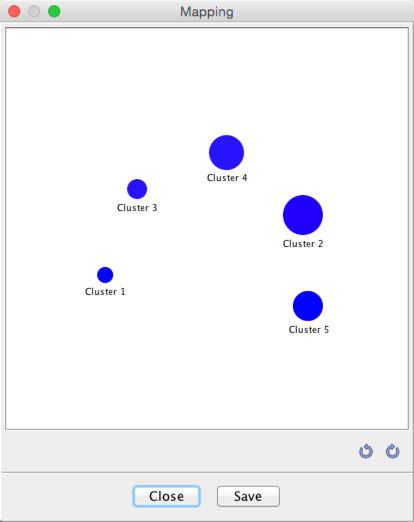
This graph displays three properties of the identified Cluster States (Cluster 1-Cluster 5) within the new Factor node, [Factor_0]:
- The saturation of the blue represents the purity of the Cluster States: the higher the purity, the higher the saturation of the color. Here, all purities are in the 90%+ range, which is why they are all deep blue.
- The sizes represent the respective marginal probabilities of the Cluster States. We will see this distribution again once we open the Monitor of the new factor node.
- The distance between any two clusters is proportional to the neighborhood of the clusters.
Quadrants
Clicking the Quadrants button in the report window brings up the options for graphically displaying the node’s relative importance with regard to the induced [Factor_0].
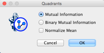
For our example, we select Mutual Information. Furthermore, we do not need to normalize the means as all values of the Manifest nodes in [Factor_0] are recorded on the same scale.
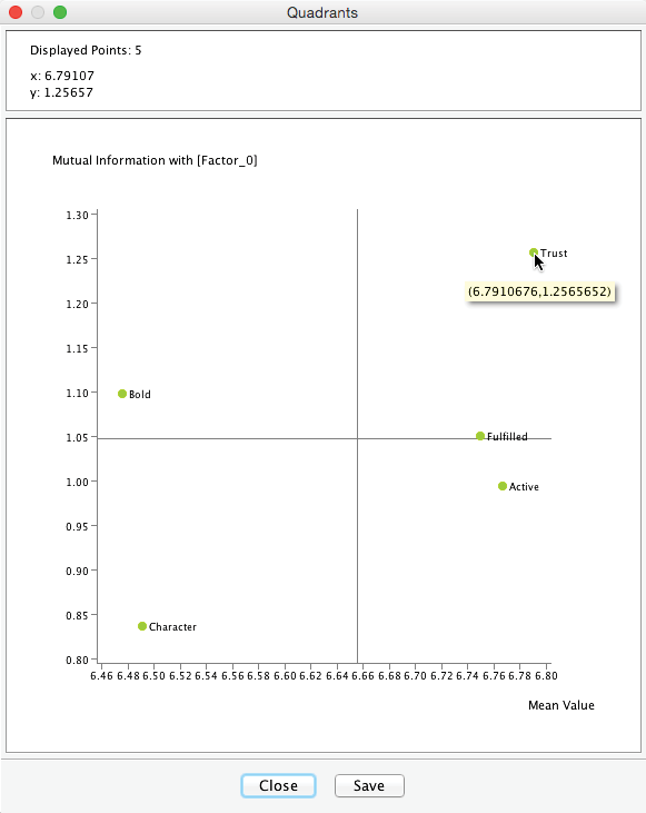
This Quadrant Plot highlights two measures that are relevant for interpretation:
- Mutual Information on the y-axis, i.e., the importance of each Manifest variable with regard to [Factor_0].
- The mean value of each Manifest variable on the x-axis.
This plot shows that the most important variable is Trust with I(Trust,[Factor_0])=1.26. It is also the variable with the highest expected satisfaction level, i.e., E(Trust)=6.79.
When hovering with the cursor over the plot, the upper panel of the Quadrant Plot window returns the exact coordinates of the respective point, i.e., Mutual Information and Mean Value in this example.
We return to the Graph Panel after closing the Quadrant Plot and the report window. It shows the newly induced [Factor_0] directly connected to all its associated Manifest variables. Applying the Automatic Layout P produces a suitable view of the network produced by the Data Clustering process.
After switching to the Validation Mode F5, we open the Monitors for all nodes. We can see five Cluster States for [Factor_0], labeled C1 through C5, as well as their marginal distribution. This distribution was previously represented as the “bubble size” of Clusters 1-5.
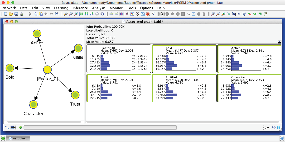
In the Monitor of [Factor_0], we see that the name of each Cluster State carries a value shown in parentheses, e.g., C1 (2.022). This value is the weighted average of the associated Manifest variables given the state C1, where the weight of each variable is its Relative Significance with respect to [Factor_0]. That means that given the state C1 of [Factor_0], the weighted mean value of Trust, Bold, Fulfilled, Active, and Character is 2.022. This becomes more apparent when we actually set [Factor_0] to state C1.
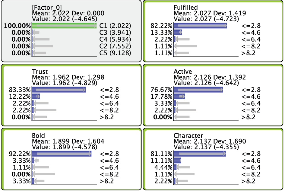
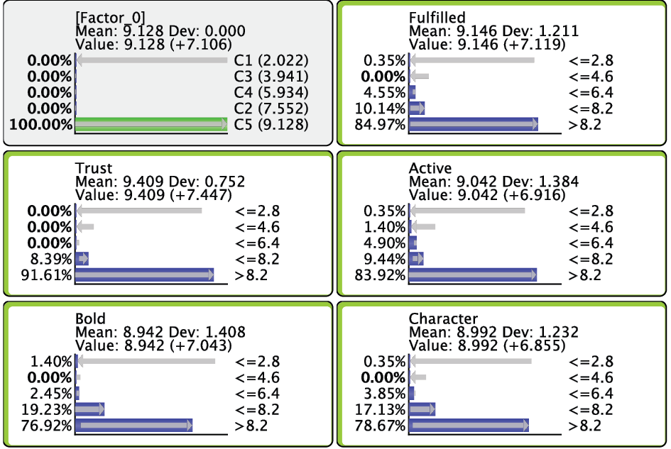
Given that all the associated Manifest variables share the same satisfaction level scale, the values of the created states can also be interpreted as satisfaction levels. Cluster State C1 summarizes the “low” ratings across the Manifest nodes. Conversely, C5 represents mostly the “high” ratings; the other states cover everything else in between.
It is important to understand that each underlying record was assigned a specific state of [Factor_0]. In other words, the hidden variable is no longer hidden. It has been added to the dataset and imputed for all respondents. The imputation is done via Maximum Likelihood: given the satisfaction levels observed for each of the 5 Manifest variables, the state with the highest posterior probability is assigned to the respondent.
We can easily verify this by scrolling through each record in the dataset. To do so, we first set [Factor_0] as Target Node by right-clicking on it and selecting Set as Target Node from the Contextual Menu. Note that the Monitor corresponding to the Target Node turns red.
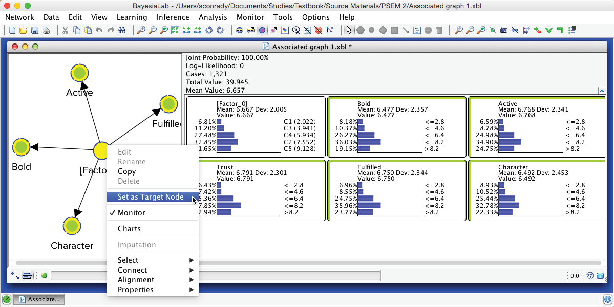
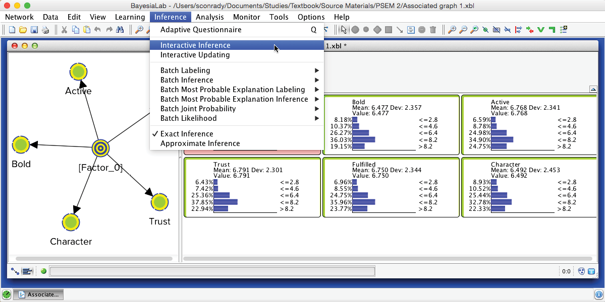
Then, we select Menu > Inference > Interactive Inference.
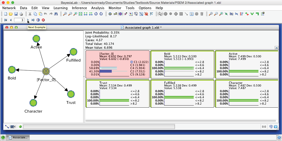
Using the Record Selector in the extended toolbar, we can now scroll through each record in the associated dataset. The Monitors of the Manifest nodes show the actual survey observations, while the Monitor of [Factor_0] shows the posterior probability distribution of the states given these observations. The state highlighted in light blue marks the modal value, i.e., the “winning” state, which is the imputed state now recorded in the dataset. Clicking the Stop icon closes this function.
Network Performance Analysis
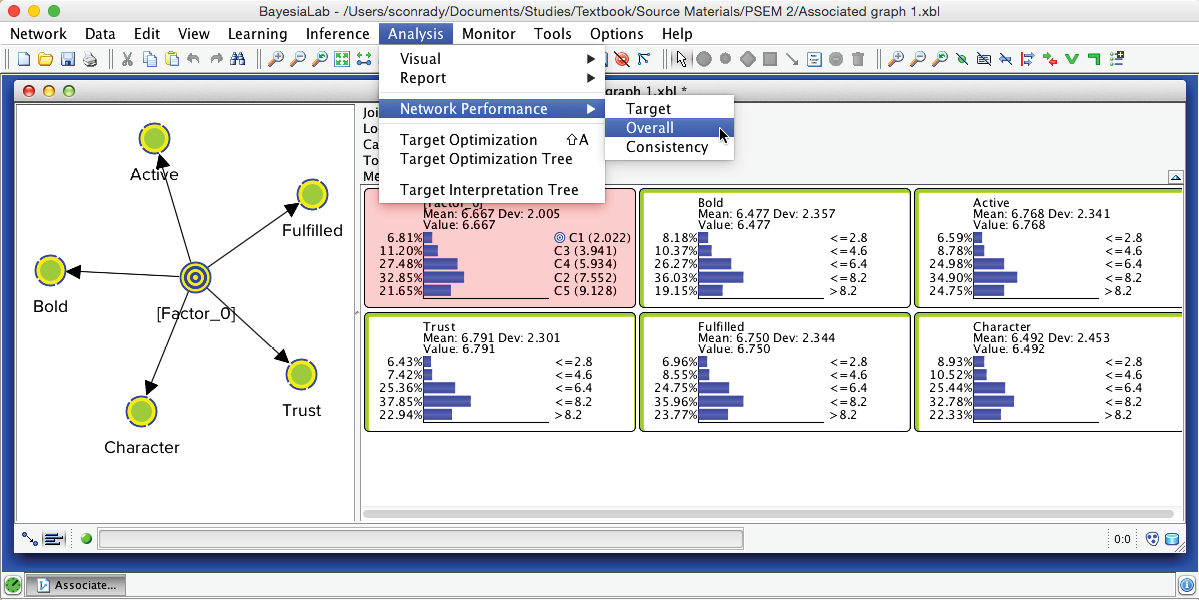
While the performance indices shown in the Data Clustering Report have already included some measures of fit, we can further study this point by starting a more formal performance analysis: Menu > Analysis > Network Performance > Overall.
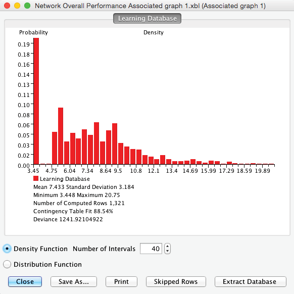
The resulting report provides measures of how well this network represents the underlying dataset.
Contingency Table Fit
Of particular interest is BayesiaLab’s Contingency Table Fit (CTF), which measures the quality of the Joint Probability Distribution (JPD) representation. It is defined as:
where:
is the mean of the log-likelihood of the data given the network currently under study, and is the mean of the log-likelihood of the data given the fully unconnected network, i.e., the “worst-case scenario,” and
is the mean of the log-likelihood of the data given the fully connected network, i.e., the “best-case scenario.” The fully connected network is the complete graph in which all nodes have direct links to all other nodes. Therefore, it is the exact representation of the chain rule without any conditional independence assumptions in the representation of the joint probability distribution.
Accordingly, we can interpret the following key values of the CTF:
- CTF is equal to 0 if the network represents a joint probability distribution no different from the one produced by the fully unconnected network, in which all the variables are marginally independent.
- CTF is equal to 100 if the network represents the joint probability distribution of the data without any approximation, i.e., it has the same log-likelihood as the fully connected network.
The main benefit of employing CTF as a quality measure is that it has normalized values ranging between 0% and 100%.
This measure can become negative if the parameters of the model are not estimated from the currently associated dataset.
CTF in Practice
It must be emphasized that CTF measures only the quality of the network in terms of its data fit. As such, it represents the second term in the definition of the MDL Score:
Even though this says the higher the CTF, the better the representation of the JPD, we are not aiming for CTF=100%. This would conflict with the objective of finding a compact representation of the JPD.
The Naive structure of the network used for Data Clustering implies that the entire JPD representation relies on the Factor node. Removing this node would produce a fully unconnected network with a CTF=0%. Therefore, BayesiaLab excludes—but does not remove—the Factor node when computing the CTF. This allows measuring the quality of the JPD representation with the induced clusters only.
It is not easy to recommend a threshold value below which the Factor should be “reworked,” as the CTF depends directly on the size of the JPD and the number of states of the Factor. For instance, given a Factor with 4 states and 2 binary Manifest variables, a CTF any lower than 100% would be a poor representation of the JPD, as the JPD only consists of 4 cells. On the other hand, given 10 manifest variables, with 5 states each, and a Factor also consisting of 5 states, a CTF of 50% would be a very compact representation of the JPD. This means that 5 states would represent a JPD of 510 cells with a quality of 50%.
Returning to the context of our PSEM workflow, we have the following 3 conditions:
- A maximum number of 5 variables per cluster of variables;
- Manifest variables with 5 states;
- Factors with a maximum of 5 states.
In this situation, we recommend using 70% as an alert threshold. However, this threshold level would have to be reduced if conditions #1 and #2 increased in their values or if condition #3 decreased.
Multiple Clustering
The previous section on Data Clustering dealt exclusively with the induction of [Factor_0]. In our perfume study, however, we have 15 clusters of Manifest variables, for which 15 Factors need to be induced. This means all steps applicable to Data Clustering must be repeated 15 times. BayesiaLab simplifies this task by offering the Multiple Clustering algorithm, which automates all necessary steps for all Factors.
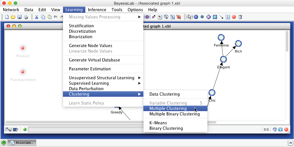
We now return to the original network. On this basis, we can immediately start Multiple Clustering: Menu > Learning > Clustering > Multiple Clustering.
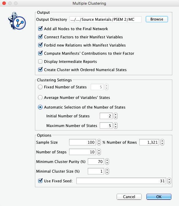
Compared to the dialogue box for Data Clustering, the options for Multiple Clustering are much expanded. Firstly, we need to specify an Output Directory for the to-be-learned networks. This will produce a separate network for each Factor, which we can subsequently examine. Furthermore, we want the new Factors to be connected to their Manifest variables, but we do not wish the Manifest variables to be connected among themselves. We have already learned the relationships between the manifest variables during Step 1. These relationships will ultimately be encoded via the connections between their associated Factors in this Step 3. We consider these new Factor nodes to belong to the second layer of our hierarchical Bayesian network. This also means that, at this point, all structural learning involving the nodes of the first layer, i.e., the Manifest variables, is completed.
We set the above requirements via Connect Factors to their Manifest Variables and Forbid New Relations with Manifest Variables. Another helpful setting is Compute Manifests’ Contributions to their Factor, which helps to identify the dominant nodes within each Factor.
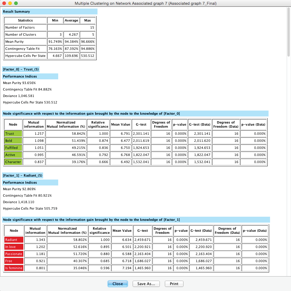
The Multiple Clustering process concludes with a report showing details regarding the generated clustering. Among the many available metrics, we can check the minimum value of the Contingency Table Fit, which is reported as 76.16%. Given the recommendations we provided earlier, this suggests that we did not lose too much information by inducing the latent variables.
We can save the report or proceed to the new network in the Graph Panel, which has all nodes arranged in a grid-like arrangement: Manifest variables are on the left; the new Factors are stacked up on the right.
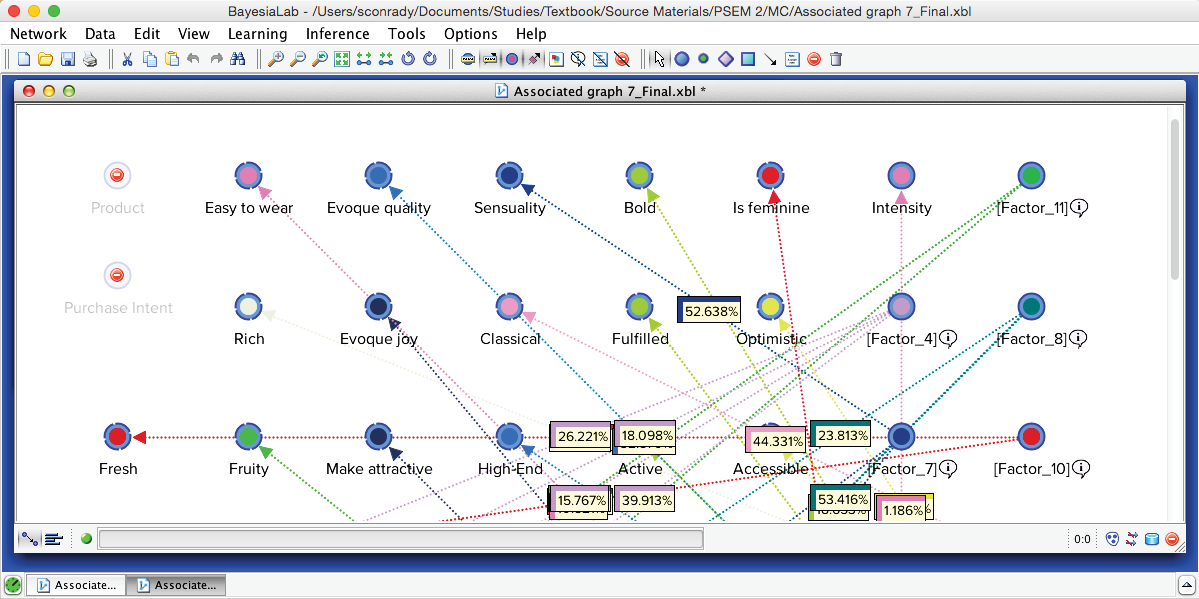
Upon applying Automatic Layout (P), we can identify 15 Factors surrounded by their Manifest nodes, arranged almost like a field of flowers.
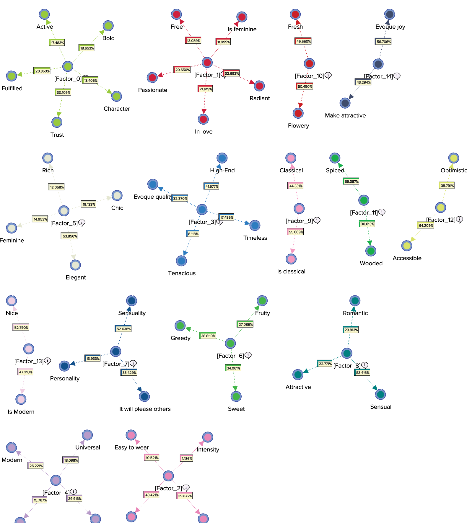
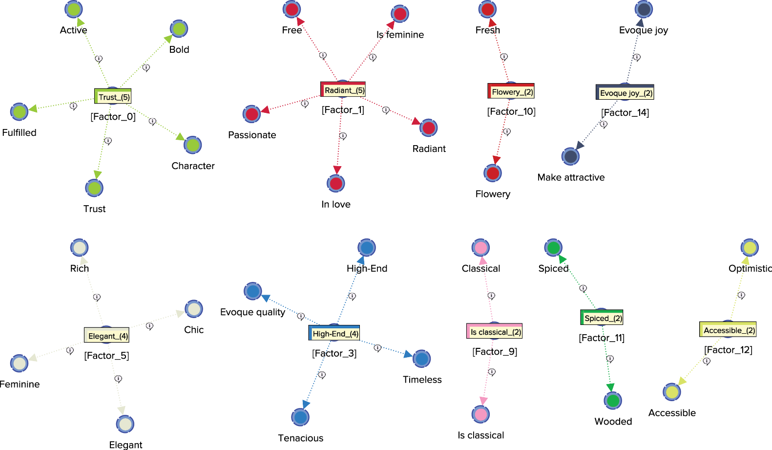
The Arc Comments, shown by default, display the Contribution of each Manifest variable towards its Factor. Once we turn off the Arc Comments and turn on the Node Comments, we see that the Node Comments contain the name of the “strongest” associated Manifest variable, along with the number of associated Manifest variables in parentheses. The following graph includes a subset of the nodes with their respective Node Comments.
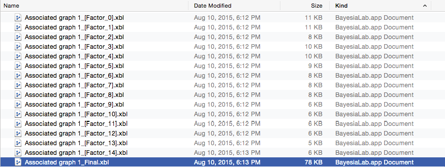
Also, by going into our previously specified output directory, we can see that 15 new sub-networks—in BayesiaLab’s XBL format for networks—were generated. Any of these files would allow us to study the properties of the sub-network, as we did for the single Factor, [Factor_0] that was generated by Data Clustering.
Additionally, one more file was created in this directory, which is highlighted in the screenshot below. The file marked the suffix “_Final” is the network that consists of both the original Manifest variables and the newly created Factors. As such, it is labeled as the “final” network in BayesiaLab parlance. It is also the network that is currently active.
In this context, BayesiaLab also created two new Classes:
- Manifest, which contains all the manifest variables;
- Factor, which contains all the latent variables.
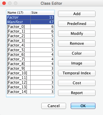
Opening the Class Editor confirms their presence (highlighted below).
