Conditional Mean Analysis (5.0.7)
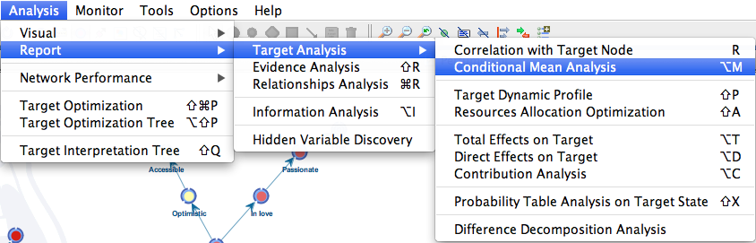
Report
A new report is now available for analyzing the variables’ mean values given each state of the target variable
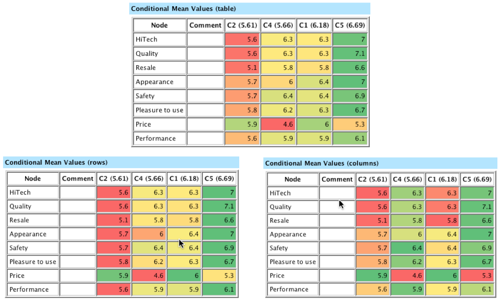
This report consists of four tables:
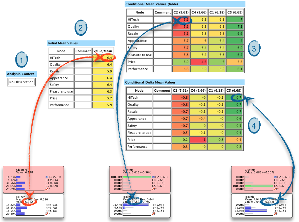
The cells of tables #3 and #4 are colored conditional on their value:
-
from red for the lowest values within the entire table to green for the highest ones. Yellow identifies the middle range of values. Each of these two tables also comes with a “row view” and “column view”:
-
for the row view, the minimum (red) and maximum (green) values are computed for each row
-
for the column view, the minimum (red) and maximum (green) values are computed for each column
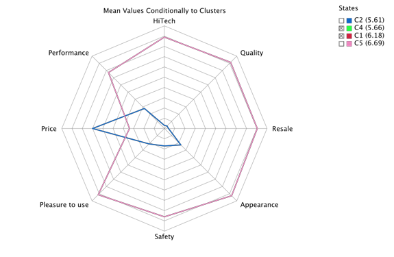
Radar Chart
A Radar Chart can also be generated from the conditional mean values and delta mean values of the previous report.
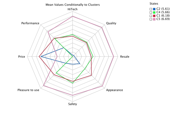
Example
We can quickly see here that Cluster C5 (pink) corresponds to highly-rated products across all dimensions, with the exception of the price dimension.
Hiding Curves
Clicking the boxes (or Ctrl-Click / cmd-Click) in the legend hides the corresponding curves in the chart (“x” as in excluded). Clicking again returns them to the chart.
This “hide line” function is now available in all of BayesiaLab’s graphs
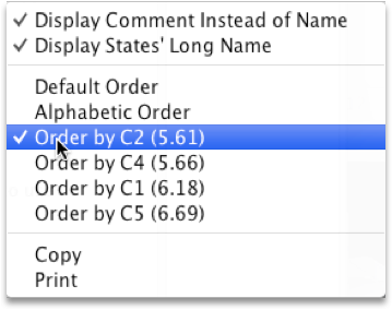
Sorting Curves
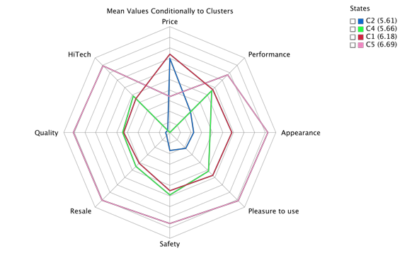
The ordering of the variables on the radar can be based on:
- their Mutual Information with the target node
- their alphabetic order
- their mean value given the selected state, in descending order
Hovering over a Curve
Again, hovering over a curve brings up the tool tip, changes the thickness of the curve and the size of its corresponding legend box.
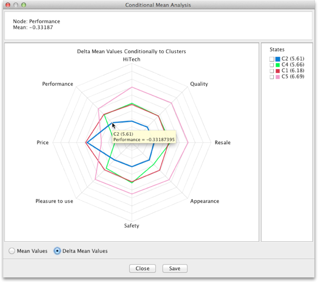
This new feature is available in all of BayesiaLab’s graphs.