Colored Line Plot
Context
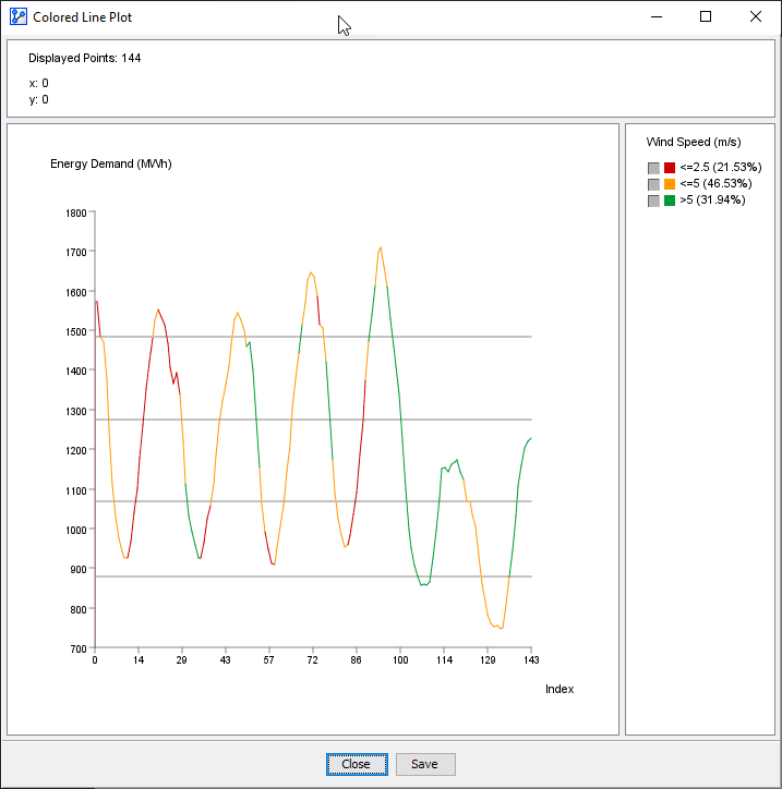
The Colored Line Plot is a convenient tool for plotting sequential data, such as time series.
In addition to plotting a primary variable on the y-axis, a second variable can be used to assign a color to the line of the primary variable.
Usage
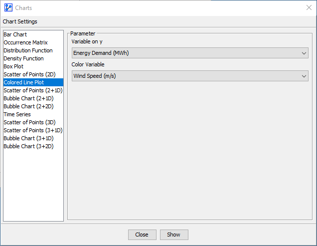
- You can access the Colored Line Plot function in multiple ways:
Main Menu > Data > Charts > Colored Line Plot.Node Context Menu > Charts > Colored Line Plot.
- In the Parameter panel:
- Select the variable to plot from the Variable on y dropdown menu.
- From the dropdown list, pick the Color Variable.
- If you had nodes selected when you opened the Charts window, the variables in the dropdown menu are restricted to that selection.
- Click
Show.
- The horizontal lines on the plot indicate the thresholds of the intervals for the y variable. In the screenshot below, we see four lines, i.e., four thresholds, which means that the distribution is currently binned into five intervals. Note that these thresholds are for reference only and cannot be modified here.
- At the top of the chart window, the Information Panel reports the total number of plotted points plus the x and y coordinates of the cursor position.
- To zoom in to the chart, click and hold the left mouse button. Drag the cursor to designate the area to focus on. Then, release the mouse button. Note that the size of the points remains unchanged regardless of the zoom level.
- To revert to the default zoom level, double-click anywhere on the chart.
- Note that you can change the line colors by clicking on the color fields in the Legend Panel.