Scatter of Points (2D)
Context
For exploratory data analysis, generating a scatter plot can be very helpful.
Within the Charts function, BayesiaLab offers Scatter of Points (2D) as a type of plot for that purpose.
Usage
- You can access the Scatter of Points (2D) function in multiple ways:
Main Menu > Data > Charts > Scatter of Points (2D)Node Context Menu > Charts > Scatter of Points (2D)
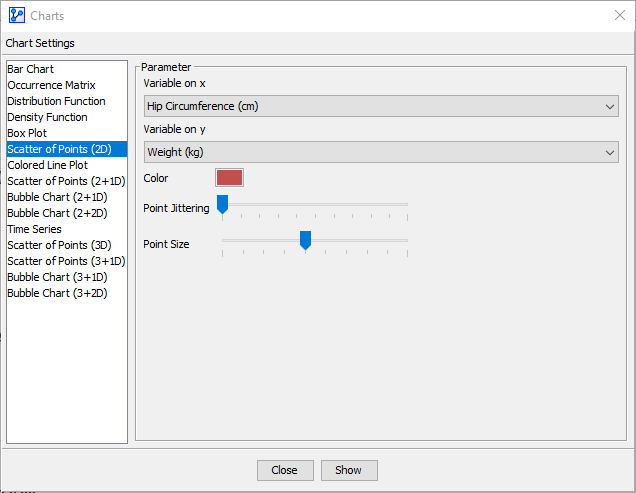
- In the Parameter panel, select the variables to plot from the dropdown lists:
- Select Variable on x.
- Select Variable on y.
- If you had nodes selected when you opened the Charts window, the variables in the dropdown menus are restricted to that selection.
- Choose a Color.
- Apply Point Jittering if appropriate:
- The Point Jittering slider allows you to add random noise to the position of each point to reduce overlap when many observations have the same coordinates, which is the case with integer variables, for instance.
- The Point Jittering remains the same at all zoom levels.
- Choose the Point Size:
- Click
Show.
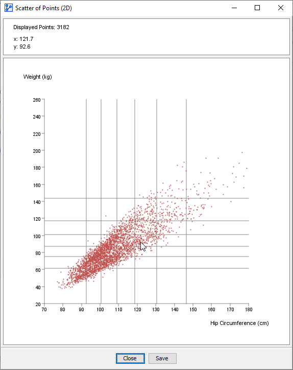
- The horizontal and vertical lines on the plot indicate the thresholds of the intervals for the x and y variables, respectively. In the screenshot above, we see six lines, i.e., six thresholds, which means that the distribution is currently binned into seven intervals. Note that these thresholds are for reference only and cannot be modified here.
- At the top of the chart window, the Information Panel reports the total number of plotted points plus the x and y coordinates of the cursor position.
- To zoom in to the chart, click and hold the left mouse button. Drag the cursor to designate the area to focus on. Then, release the mouse button. Note that the size of the points remains unchanged regardless of the zoom level.
- To revert to the default zoom level, double-click anywhere on the chart.
- If you click on a particular point, a pop-up window shows all the records that match its coordinates. Note that a larger point size will make it much easier to click on a point of interest.
Workflow Animation
Demo Files
NHANES_DEMO_BMX.xbl