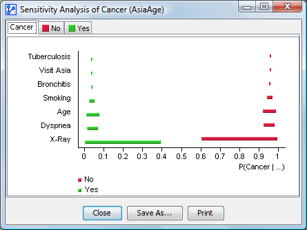
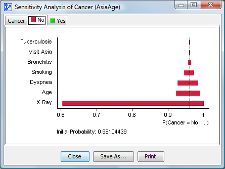
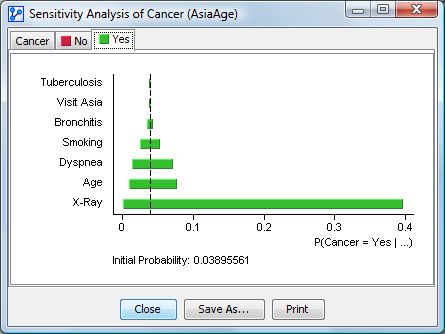
Target Sensitivity Analysis
This tool visualizes the impact of the network’s variables on each state of the Target Node. The variation range of each state is displayed based on each node’s values. The ranges are sorted from strongest at the bottom to weakest at the top. The first thumbnail represents the variations of all states in one graph. The following thumbnails represent the variations for each state.
The analysis is performed on all nodes or on a subset of selected nodes. Translucent nodes are not taken into account. The context of the observations is displayed under the graphs when necessary. The initial probability of each state is displayed at the bottom of the chart.
A context menu allows you to display the node comments instead of the node names and the long names of the states. It also allows you to copy the chart as an image.