Network Performance Analysis: Target — Gains Curve
When you are faced with the problem of predicting the value of a particular variable (the value of the target node), the evaluation of the model can be performed using the gain curve.
The Gains Curve is generated by sorting, in decreasing order, the individuals according to the target value probability returned by the network, e.g., the fraud or churn probability. The X-axis represents the rate of individuals that are taken into account. The Y-axis represents the rate of individuals with the target value that have been identified as such.
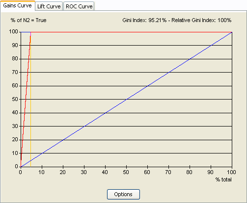
In the Gains Curve below, nearly 5% of individuals have the target value (yellow). The blue curve represents the gain curve of a purely random policy, i.e., choosing the individuals without any order. The red curve represents the gain curve corresponding to the optimal policy, i.e., where the individuals are sorted according to the perfect model. Choosing the first 5% of individuals allows you to capture 100% of the individuals with the target variable with the optimal policy, versus only 5% with the random policy.

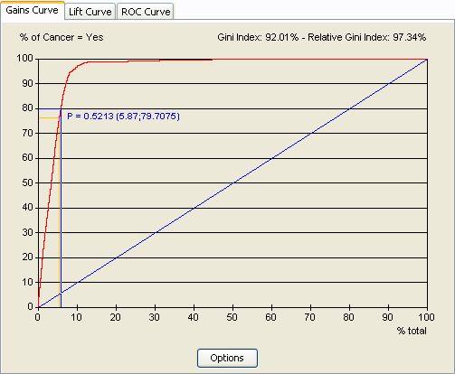
A left-click on the curve shows exact coordinates of the corresponding point and the probability of the target value of the associated case.
For example, the screenshot below indicates that the selection of the first 5.87% cases implies a detection rate of 79.71%. It also indicates that the last case of that selection has a probability of having the target value equal to 52.13%.
The Gini Index and the Relative Gini Index are computed according to the curve and displayed at the top of the graphic. The Gini Index is computed as the surface under the red curve and above the blue curve divided by the surface above the blue curve. But, as shown above, the surface of the optimal policy is less than the surface above the blue line, so the relative Gini index is computed as the surface under the red curve and above the blue curve divided by the surface under the curve of the optimal policy and above the blue curve. It is a more representative coefficient.
This interactive curve is not only an evaluation tool. It is also a decision support tool that allows you to define the best probability threshold above which an individual will be considered as belonging to the target.

A right-click on the graphical zone allows choosing between printing the curve and copying it to the clipboard. In the latter case, it is possible to paste it directly as an image or to paste the corresponding data points.
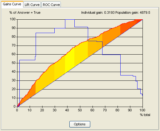
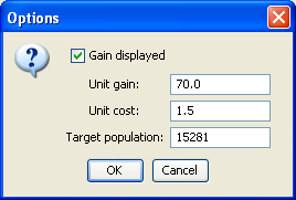
The gain curve includes a tool that automatically analyzes the expected economic gains with the evaluated model. These computations follow the definition of the unit costs corresponding to the treatment of each individual (x-axis), the unit gains corresponding to each positive answer (y-axis), and the target population size. The economic gain is then defined as the difference between the profit corresponding to the treatment of x% of the population and the profit corresponding to the treatment of the whole population. As the following screen capture shows, the result is displayed as a curve (blue curve) and as a gradient of color (the closer we are to the yellow, the closer we are to optimality).

The economic parameters can be modified with the following dialog:

