BayesiaLab Use Analysis
This analysis can be accessed via Main Menu > Help > Use Analysis.
By tracking the usage of each menu in BayesiaLab’s menu bar, it is possible to create a graphical analysis of tool usage.
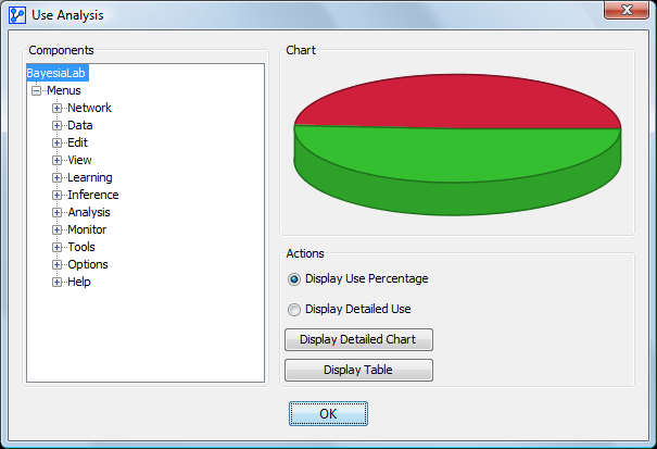
The window contains a tree of BayesiaLab’s menus on the left-hand side. Each item can be selected, and the usage chart appears on the right as a pie chart. Pie charts can be displayed in two formats that can be selected by the options on the right:
- Use percentage indicates the number of used functions and the number of never-used functions.
- Detailed use indicates the number of times each function was used.
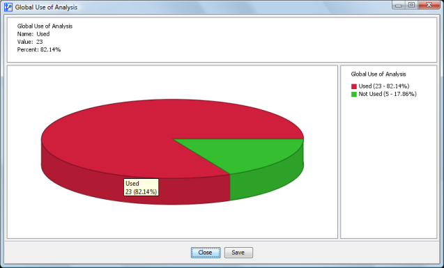
The following figure shows the overall use of BayesiaLab, i.e., the number of functions used (red) and the number of functions never used (green). Move the mouse pointer to display a tooltip corresponding to the specified area.
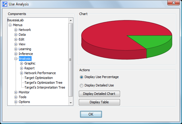
When you select a menu or submenu in the tree on the left, the graph shows only the usage of the selected menu and its submenus. In the following figure, the Analysis menu is selected:
To see the detailed chart, press the Display Detailed Use button, which displays a window containing a larger chart and details of usage on the right-hand side.
When you click on the second option, the chart displays the number of times each function was used, according to the menu selected in the tree:
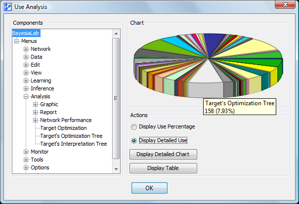
To see the detailed chart, press the Display Detailed Use button. The right-hand side shows, for each sector, the number and percentage of use compared to the sum of all uses.
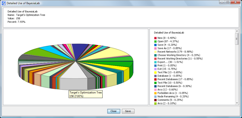
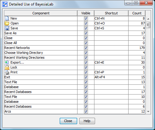
The button Display Table opens a new window containing the table of all BayesiaLab menus with their names, icons, visibility, shortcuts, and number of uses. When a row is selected, pressing the Help button displays the help corresponding to the function, if it exists.
The table is sortable by clicking on each column’s header.