Network Performance Analysis: Target — Lift Curve
When one is faced with the problem of predicting the value of a particular variable (the value of the target node), the evaluation of the model is often performed using the lift curve.
This curve comes from the Gains Curve and highlights the improvement between the policy returned by the current Bayesian network and the random policy. The X-axis represents the rate of individuals that are taken into account. The Y-axis represents the lift factor defined as the ratio between the rate of the targeted population obtained with the current policy and the rate obtained with the random policy.
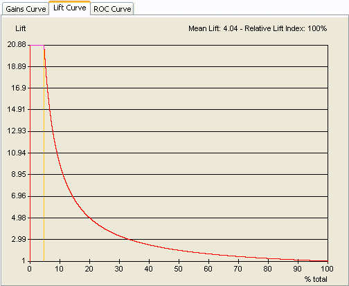
The curve below is the optimal Lift curve corresponding to the first Gains Curve. The best lift value, 20.88, is defined as the ratio between 100% and 4.8% (optimal policy/random policy). The lift then decreases when more than 4.8% of the individuals are considered, and is equal to 1 when all the individuals are taken into account.
In a real example, the Lift curve looks like this:
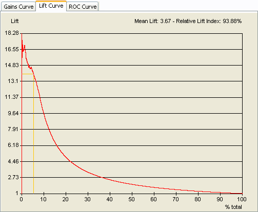
The Mean Lift and the Relative Lift Index are computed according to the curve and displayed at the top of the graphic. The Mean Lift is the mean of all the points on the curve. The Relative Lift Index is computed as the surface under the Lift curve divided by the surface under the lift curve of the optimal policy.