Curve View
Context
To illustrate the Node Editor for Continuous nodes, we use the node Sale Price from the Ames dataset, which we explain in detail in Chapter 5 of our e-book. The node represents transaction prices of residential homes in the city of Ames, Iowa, i.e., the node does have an associated dataset.
In Curve View, we see an interface very similar to the discretization step in the Data Import Wizard. Thus, there are two ways to show the distribution of the data:
- Click on the Distribution Function button to see the Cumulative Distribution Function (CDF).
- Click on the Density Function button to see the Probability Density Function (PDF).
Cumulative Distribution Function
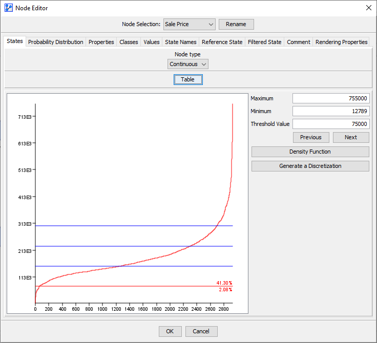
The default view shows a Cumulative Distribution Function (CDF) of the underlying data:
- On the x-axis, the observations are ordered according to the corresponding y-values, from smallest to largest.
- On the y-axis, the value of the node Sale Price is plotted.
- The horizontal lines on the plot indicate the thresholds of the intervals. In the screenshot below, we see four lines for four thresholds, which means that the distribution is currently binned into five intervals.
Usage
You can directly modify the thresholds on the CDF plot (as an alternative to editing the table in Table View)
- To select a threshold, left-click on that threshold.
- A selected threshold is highlighted in red, while all other thresholds on the plot remain blue.
- The precise numerical value of a selected threshold is shown in the Threshold Value field to the right of the plot.
- To move a threshold, click on it and hold, then move it vertically. Release to fix its position.
- The percentages displayed at the right end of a selected threshold refer to the share of observations that fall into the intervals above and below this threshold.
- Instead of moving the selected threshold with your cursor, you can also type in a specific value into the Threshold Value field.
- A vertical zoom function is available for examining the CDF curve in detail:
- Hold the Ctrl key, click-and-hold the left mouse button, then move the cursor across the vertical range on which you wish to focus.
- To revert to the default zoom, hold Ctrl, then double-click anywhere in the plot area.
- To add an additional threshold, right-click with your cursor on the desired y-position.
- To remove an existing threshold, right-click on it to delete it.
- As an alternative to selecting a threshold by left-clicking, you can scroll through all thresholds using the
PreviousandNextbuttons. - The
Generate a Discretizationfunction is largely equivalent to the Discretization step in the Data Import Wizard. Please see that topic for more details.
Workflow Animation
We illustrate the above functions in the following animation:
Probability Density Function
-
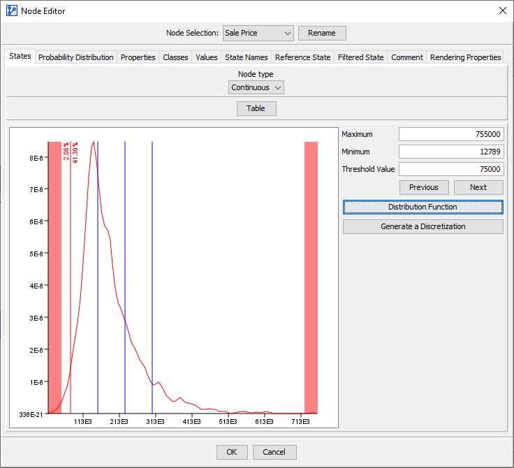
Clicking on the
Density Functionbutton brings you an alternative view of the distribution of the data. The plot now shows the Probability Density Function (PDF) of the underlying data along with the current thresholds:- The x-axis represents the observed values.
- The y-axis shows the probability density that corresponds to each value on the x-axis.
- The vertical lines on the plot indicate the thresholds of the intervals. In the screenshot below, we see four lines for four thresholds, which means that the distribution is currently binned into five intervals.
-
The distribution described in the Monitor is a discrete representation of this plot. It is then usually more natural to use the PDF view instead of the CDF view to define the thresholds.
-
As opposed to the CDF, which can be plotted directly from the dataset, the PDF needs to be estimated prior to plotting. BayesiaLab uses the Batch-Means method, which is limited in its ability to estimate the PDF near the upper and lower boundaries. The ranges in question are marked with a red, vertical band in the PDF plot. As you set or modify thresholds in the PDF plot, be aware of these limitations.
Usage (PDF View)
You can directly modify the thresholds on the PDF plot the same way as on the CDF plot.
- To select a threshold, left-click on that threshold.
- A selected threshold is highlighted in red, while all other thresholds on the plot remain blue.
- The precise numerical value of a selected threshold is shown in the Threshold Value field to the right of the plot.
- To move a threshold, click on it and hold, then move it horizontally. Release to fix its position.
- The percentages displayed at the top end of a selected threshold refer to the share of observations that fall into the intervals to the left and right of the threshold.
- Instead of moving the selected threshold with your cursor, you can also type in a specific value into the Threshold Value field.
- A horizontal zoom function is available for examining the PDF curve in detail:
- Hold the Ctrl key, click-and-hold the left mouse button, then move the cursor across the vertical range on which you wish to focus.
- To revert to the default zoom, hold Ctrl, then double-click anywhere in the plot area.
- To add an additional threshold, right-click with your cursor on the desired x-position.
- To remove an existing threshold, right-click on it to delete it.
- As an alternative to selecting a threshold by left-clicking, you can scroll through all thresholds using the Previous and Next buttons.
- The Generate a Discretization function is largely equivalent to the Discretization step in the Data Import Wizard. Please see that topic for more details.