Cluster Interpretation: Posterior Mean Analysis
Background & Context
- On this page, we present the Posterior Mean Analysis for cluster interpretation as an alternative to Most Relevant Explanations for Cluster Interpretation.
- To provide further context for Most Relevant Explanations for Cluster Interpretation, we compare several other approaches that can help interpret individual Clusters:
- Setting Evidence for Cluster Interpretation: Posterior Distributions, Relationship with Target Node, Mosaic Analysis, Posterior Mean Analysis, Segment Profile Analysis, Histograms, Tornado Diagrams,
- Optimization for Cluster Interpretation: Dynamic Profile, Target Optimization Tree
- More specifically, we compare all these approaches with regard to characterizing the state Cluster 3 of the Cluster Node Factor\_0\ in the reference network.
- All analyses and instructions on this page refer to this reference network, which you can download here:
MaleClusters.xbl
Posterior Mean Analysis
- Given that all manifest nodes feature numerical values, the Posterior Mean Analysis lends itself to interpreting the Clusters.
- To start the Posterior Mean Analysis, select Main Menu > Analysis > Report > Target > Posterior Mean Analysis.
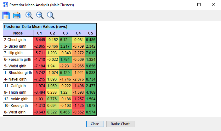
- The above screenshot shows the report section in which the Posterior Delta Mean Values are displayed. This means that values are displayed as a difference to the population mean for each row.
- Furthermore, the values are color-coded: Red marks the lowest value in each row, and green marks the highest. Values close to the row mean value are highlighted in yellow.
- This enables a quick-and-easy visual interpretation:
- Individuals in Cluster C1 are on the bottom end of the range for most measurements, while members of C5 seem to have consistently high values.
- Looking at Cluster C3, we observe a contrast: high values for upper body measurements, but only below-average values for lower body measures.
Radar Chart
- Clicking the Radar Chart button at the bottom of the Posterior Analysis Report window opens up a new window.
- The Radar Chart provides another way of visually interpreting the Cluster differences.
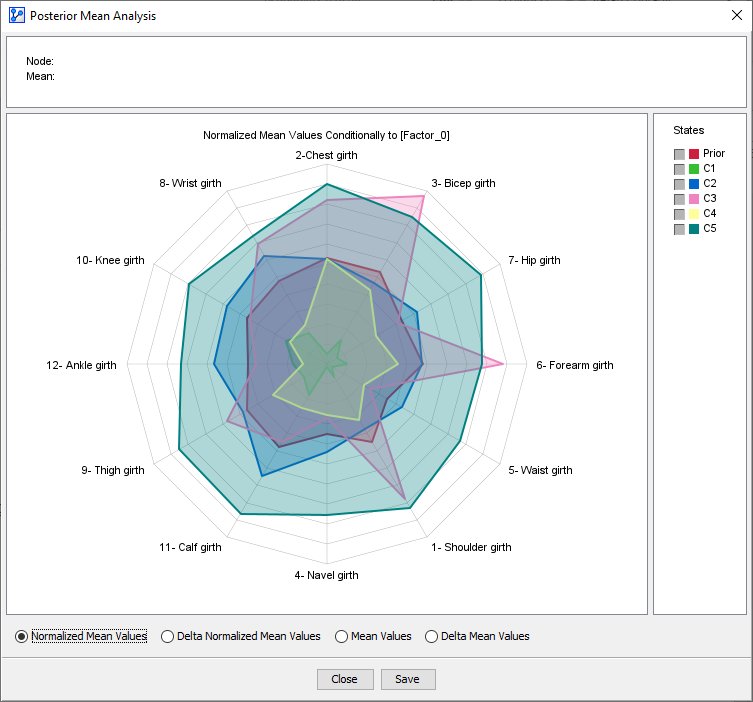
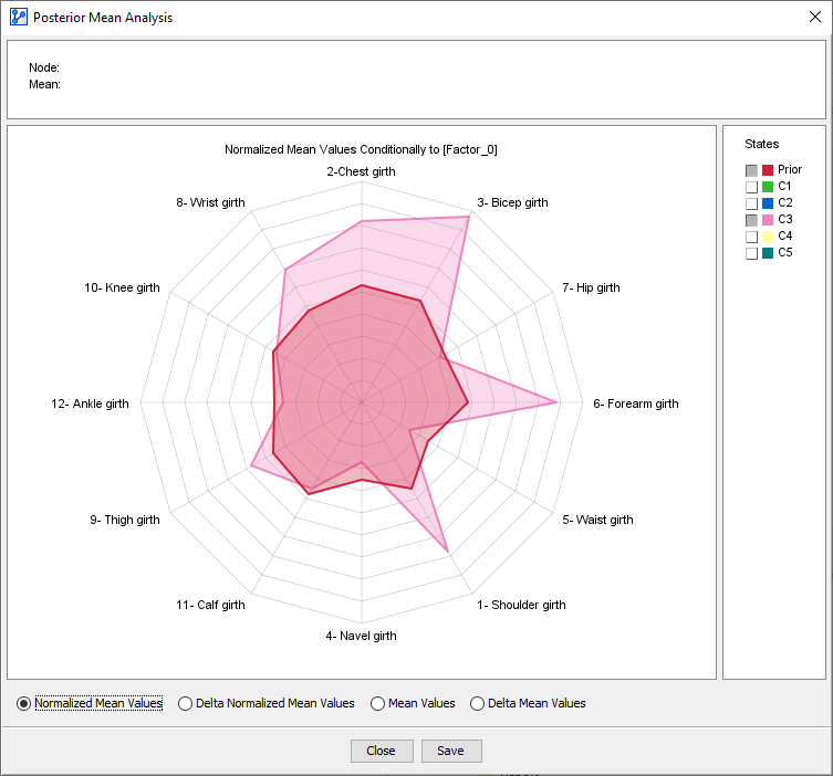
- To compare specific Clusters, we can focus on a subset, such as C3 and the Prior Values (Mean Values).
- To focus on differences, we can furthermore change the sort order of the variables. Here, we order the nodes according to the difference between the Prior and Cluster C3.
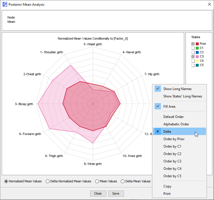
- This view highlights the strength of C3 members in terms of the upper body and the below-average values for the lower torso and the lower extremities.